Modern, minimal, which looks to tradition but above all to the new generations.
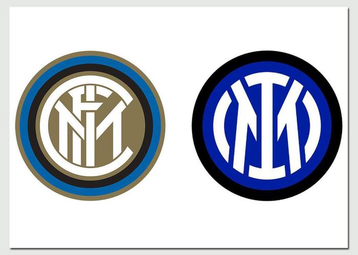
While the Nerazzurri board approves the half-year balance sheet with a --62.7 million and the ownership confirms the "never lacking financial support", Inter gets a makeover by launching its new logo: the FC name (which remains in the official name) disappears. , in the center remain the letters I and M of Inter and Milan, revisiting in a modern way the historic symbol of the club designed by Giorgio Muggiani in 1908. "The goal is to make the Inter brand relevant and recognizable", also allowing "a younger and more international audience to identify with the values of inclusion, style and innovation that have characterized Inter since its foundation ", explained the club presenting the new logo that will be used starting next season.
To reveal it, Inter have launched a campaign that, playing with the company's initials, focuses on the expression IM, from the English "I am".
Many famous faces protagonists, not only the players but also the president Steven Zhang and other VIP fans such as the basketball player Marco Belinelli and the actress Matilde Gioli.
"We wanted to find a new language that allows us to get closer to the new generations", the words to ANSA of Alessandro Antonello, Inter corporate CEO, commenting on the launch of the new logo.
"This new logo will allow us to become not only an icon of football, we already are, but above all a cultural icon", added Luca Danovaro, CMO of the Nerazzurri club and one of the main directors of the operation.
A new logo (created by the Bureau Borsche team) that divided the Inter fans.
"My love resisted Centofanti, Gianluca Festa and Lippi, the problem will certainly not be the new symbol", jokes a fan on Twitter.
"We go on, we keep up with the times", the reply of another enthusiast.
But there was no lack of contrary positions, starting with that of a vip fan like the director of La7 Enrico Mentana: "But there is really no discussion. This symbol cannot be thrown away like an old shoe", he wrote on Instagram together with the photo of the old Inter logo, while some fans have even launched petitions on the change.org platform.
"It's absolutely cool. The more I look at it, the more I like it," replies Tommaso Labate, a journalist for Corriere della Sera.
"It is very innovative, it goes towards the boys, towards those who have to make Inter become bigger - the position of former Nerazzurri Marco Materazzi, interviewed by GQ -. We are passionate old men, this is closer to today's world."
Not just the logo, because today a Board of Directors was also staged at Inter, during which the owners "reiterated that it will continue to guarantee the Club the never lack of financial support", as explained by the club in a note to ANSA.
The board approved the accounts of the half-year financial statements as at 31 December 2020, which closed with a loss of 62.7 million (-32.7 million as at 31 December 2019) due to the elimination of stadium revenues and the increase in salaries concerning registered staff.