Use of color is a derivative of cultural mindset and social transformations.
Painting a wall purple in a Parisian home will be accepted naturally, while those who paint a wall purple in an Israeli home will be perceived as innovative and daring.
We are born with different tendencies - everywhere there are colorful people with all their souls, and those who are connected to the monochromatic side of the map, but you can definitely see on the timeline the colorful association with the local culture and period.
Color has a very great power in creating change - it can stimulate, energize, calm and comfort.
The biophilic theory, which is based on the use of the meaning of color in the design of the space, preaches exactly this.
Those who plan on its basis, will choose colors in accordance with the functionality that the place is supposed to produce - relaxing colors for the bedroom and stimulating colors for the playroom, for example.
Poppy "Dim Sum" in faded colors, Reish Studio, photo: Hila Marcel Kook
About five years ago it was possible to notice a certain change, which became a trend, which continues to develop even today, of using color in product design.
International product designers, such as Patricia Urquiola, Jaime Hayon and others, began to incorporate bright colors in the mainstream items as well and not only in their special items.
The use of color, through items of furniture and accessories, has become a kind of non-threatening choice - you don't have to paint an entire wall, but you can choose an item or two that will be a stain in the space.
Lighting fixtures with colored discs, PRAT LIVING, photo: PR
It is also possible that globalization, which has created access to an abundance of products from the world's leading product designers, is giving its signals, and perhaps through this also seeps the understanding that colorful is not necessarily ornate.
Colorful can be elegant, meticulous, sophisticated, and in many cases it introduces a humorous tone, even if with a symbolic touch - and this is an important, connecting and happy tone.
With the growing openness of Israelis to colorful furniture items, the major paint companies also chose to launch their color of the year.
Not that we all want to paint the walls with it, but it certainly shows direction and openness to the subject.
Thanks to that nascent openness, local product designers also received a kind of attention that had been lacking.
The scene of product design for the home environment received a boost thanks to the approach of us, Israelis, to color.
You can see young designers such as Maor Aharon, Noa Payne, Racheli Sharpstein, Noa Razer and others, who are not afraid of color, and in their designs they make sure to incorporate the same happy and humorous note.
Hanging terra cotta pots create an interesting combination of color, shape and material Noa Razer, photo: Aya Wind
The power of a cluster: the
colorful touch can be small but significant.
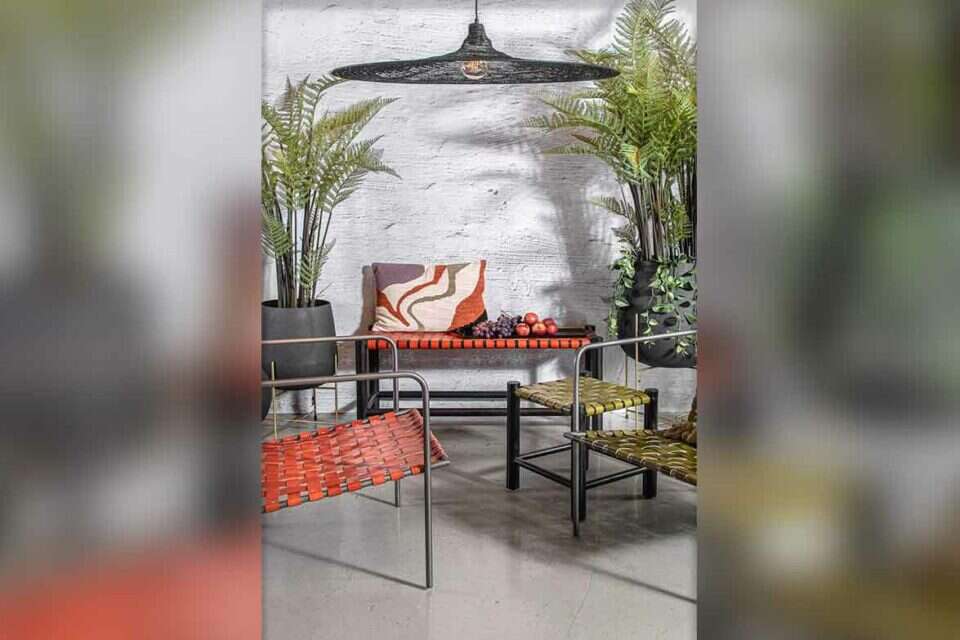
A cluster of pillows, for example, creates a power multiplier when placed on the couch in the living room.
On the one hand, it is not binding, the cluster can be dispersed at any given moment;
And on the other hand, when several colored pillows are arranged together, the resulting effect creates a whole that is greater than the sum of its parts.
Use of textiles:
through textiles you can create significant colorful touches.
It is a central element in the house, mainly because it is integrated into many parts of it: the dining chairs often come with fabric upholstery, as well as curtains, pillows, fabric seating systems, carpets, and much more.
The attention that will be given to the choice of textiles at the various points will create the color palette of the house.
Here, too, there is a developing awareness, which can be seen mainly in the textile designers who choose to work with fabrics in bolder colors than before.
The power of textiles, RENBY,
Combining contrasting
colors: Complementary colors are contrasting colors, but those that create a harmonious look.
The connection between them is very visible to the eye, so such a use will make the use of color stand out a lot.
Green and red, purple and yellow, for example, are pairs of complementary shades and you can play with them when designing a space.
The development of the color trend is evident here as well, when you see the paint companies presenting bold combinations of this type to consumers as "serving suggestions".
A red dresser against an aqua wall background, which was chosen as Tambor's color of the year, photo: Boaz Lavi and Yonatan Blum
Colorful power walls:
A power wall is an important element in the house in general.
This is a wall or a part of it that you choose to treat in a slightly different way, whether with an original covering or by painting it in a more special color.
The wall doesn't have to be big to get the special effect it will bring to the space.
It could be the wall in the foyer, a certain wall strip in the kitchen, the wall behind the sink in the bathroom, and much more.
On the one hand, there is something fun and liberating about choosing a wall and letting yourself go wild with its design;
On the other hand, it is reassuring to know that this is a small part and not the whole house.
Kind of eat the cake and leave it whole.
The colorful trend has gained its own power, and is developing at a pace that is becoming faster.
We have not parted with the brown, the gray, the white and the touches of black, but we are definitely creating an increased openness towards slightly bolder color spots that will fit into our space.
A space decorated in happy colors, design: Tola Studio, photography: Maor Moyal, courtesy of Aloni
The important tips - take the vegetation into account
Combine useful tools as paint spots
Colorful doesn't have to be just decorative.
Dare to combine color with everyday tools, such as the tool for the toothbrush or a combination of colorful chairs around a table that can have a quiet monochromatic color.
A side table for placing the coffee and cake can be a lovely splash of color in the space, and even the interior doors can be chosen in a color that matches your design style.
A mirror in metallic shades hangs behind a bouquet of flowers.
The reflection of the stranger in the mirror adds another important layer.
Reish Studio,
Pay attention to designed vases
The bouquet of flowers is important, as mentioned, and it is also important to place it correctly in the space, but the one who really steals the show is the vase that contains the flowers.
Playing with several vases is similar to playing with a cluster of pillows - you can scatter them in the space or place them all in one place.
Decorated glass vases, Noa Payne,
Try to make friends with the color
Don't be afraid of the color.
When it comes to walls, choose a wall that is not large or a part of it - that way the decision on painting or on a certain covering will not be fateful.
Colorful textiles will help you place stylish points in the space, which in most cases can be moved from place to place.
The more you become friends with the color, the more daring you will be.
iota is an example of a brand that introduced intense colors of forest green and royal blue in its latest collection.
Knitted rug and poufs from iota, an organization that employs underprivileged populations of women around the world, photo: Noam Frysman
Treat the bouquet as a spot of paint
If you are the ones who choose it, make sure it matches the color palette around it.
Placing a bouquet of flowers on a decorative mirror background, for example, will create a rich reflection, which will double the volume and further emphasize the colors.
A door in an olive shade, complements the natural look that characterizes the sleeping space, Hamadia Doors, photo: Public Relations
This is how you combine color
Pink seating system, Tolman's Dot,
A carpet with a geometric pattern, the Bitate,
decorative buddha statue, flying tiger copenhagen,
A table in the shape of a chess soldier in a metallic purple shade, CHESS, Pietro Hecht,
A pair of serving spoons with colorful handles, Naaman, photo: Shira Raz
Antique looking lighting fixture, Technolite,
A plate designed in the shape of an arch, flying tiger copenhagen,
Red standing sink, HeziBank_ ANTONIOLUPI,
A decorated matznam, in collaboration with Dolce & Gabbana, Samag,
Chaise lounge pouf in a denim shade, positive,
Menachem Oz,
were we wrong
We will fix it!
If you found an error in the article, we would appreciate it if you shared it with us