
If the cover is the face of a book, the Spanish tradition has always been more in favor of the clonic children, dressed in uniform and perhaps with slight variations in hairstyle. With Austral's precedent, publishers have struggled for decades to create strong, recognizable brand images in bookstores, and that put the identity of the publisher and the stamp above the personality of each book. Authors and titles are thus diluted in Anagrama yellow, Tusquets black, Seix Barral white or T stocking designed by Enric Satué, who for decades has identified Alfaguara. That group identity sales strategy, however, leaves a hint of creativity for designers, which can be traced back to when we review the latest releases.
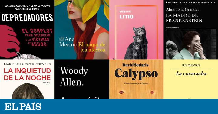
The Cockroach (Anagram), by Ian McEwan, surprises precisely because of the contrast between the unchanging yellow and the disturbing and dark silhouette of the bug. A literal reference and a basic, but efficient image retouching, which brings us back to both Brexit and Kafka, the two central elements of this ferocious parody. And, looking for references, it also refers us to the conceptual work based on objects that populated the thousands of covers designed by Daniel Gil for Alianza. In the case of The Mother of Frankenstein (Tusquets), the latest novel by Almudena Grandes, the graphic brilliance rests entirely on the selection and cutting of a photo that manages to transmit anguish and horror through a gesture and a hand. The catalog of photographs from the first half of the 20th century is an inexhaustible source of cover material. In this case, the narrative value of the image appears when we contrast the elegant clothes, the pastel colors and the pearl earring against broken nails and a look devastated by anguish.
This desire to “create an identity” is also perceived in the catalog for the 2019 and 2020 campaign of the Caballo de Troya publishing house, in which each change of editor, which officiates for only two years, is accompanied by a design change . The pink and the gradient frame are excesses that scream "look at me!" and that they work precisely because they expire at the end of the mandate . In Malén Denis' Lithium , the trick by repetition and the cat's presence are graphic codes that refer to generational literature and social networks. Meanwhile, Calypso , the latest from David Sedaris, is another example of how you can create a recognizable editorial brand image (the massive, resounding condensed type titles that dot the entire Blackie Books catalog) and, at the same time, trying to make the design of each cover breathe a certain identity of its own. The face that looks at us on this cover conveys the humor of a casual pareidolia that sees faces in the veins of a wood and, at the same time, the feeling that that face watches us with an impossible melancholy.
Other labels, such as Destino, maintain their minimalist typographic discipline, but combine it with large illustrations that allow each title to be individualized a bit. This is the case of The Map of Affections, by Ana Merino. Irene Blasco's magnificent illustration speaks to us in a language of natural and vibrant color, full of life. These figurative and realistic drawings, however, run an important risk: that the illustrator's imagination conditions that of the readers in the portrait of the characters. Other less literal styles, such as Marieke Lucas Rijneveld's The Restlessness of the Night , immerse the potential reader in the literary universe of the novel in a less defined way.
When creating a cover, the designer has three basic tools: the image, the color and the letter, and it is difficult to find examples that combine this trio to achieve a harmonious ensemble. In this case, the illustration has enormous evocative power, although the cover fails from the moment the text and the image are barely related to each other. Neighbors, but not friends.
Yes, there are radically different ways to interpret these elements, and these two books are an example of terms that are graphically, conceptually and biologically opposed: Woody Allen's memoirs , About Nothing (Alliance), published today Thursday , and Predators (Roca), by Ronan Farrow, his son and one of his main detractors. The cover of Purpose of Nothing Plays Two Cards: On the one hand, the white-on-black text conveys a certain sincerity, even helplessness. There are only three color details to literally punctuate each line of text. On the other hand, resorting to a naked typeface is an obvious nod to the credits of his films. The reference is not literal (the Allenian typeface par excellence is called Windsor, and it is similar but not the same), but the author's fans are, so to speak, on familiar ground.
For its part, Ronan Farrow's book also uses a cinematographic reference, but totally opposite. The broken letters and the color-stained illustration refer to the posters designed by Saul Bass for some of Alfred Hitchcock's best-known films. The accumulation of texts and attention calls breathes intrigue, scandal, drama. Even the italics inclined in both directions, a display of journalistic dynamism for a book that seeks, above all, to impact.