
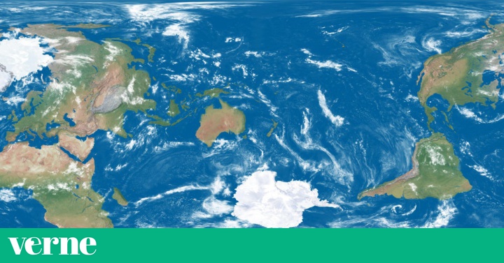
If we take a conventional world map, New Zealand are those islands that are in the lower right corner. That is why it is not common to see this country in the center, as in the example shared on Twitter by Simon Kuestenmacher, a German geographer who lives in Australia. The post has been shared hundreds of times since last Saturday.
Promised a kiwi friend to repost this world map centered on New Zealand. Enjoy! Source: https://t.co/5lJgf2EaDU pic.twitter.com/tg6Hf5LW45
- Simon Kuestenmacher (@ simongerman600) August 8, 2020I promised a New Zealand friend that I would share this map focused on New Zealand. Enjoy it!
The map is the work of the American Daniel Arnett, who shared it on Reddit a year ago. Arnett explains to Verne by email that it was a nod to another Reddit sub-forum, Maps without New Zealand, which includes examples of world maps in which this country has been left out, in a similar way to how the Canary Islands are forgotten in some maps of Spain. Even a New Zealand tourism campaign used this idea, in an ad starring Prime Minister Jacinda Ardern and comedian Rhys Darby (known for being the manager of Flight of the Conchords on the HBO series).
When he made the plane, Arnett was working developing videos in the planetarium of his university, Slippery Rock (Pennsylvania, United States). It had come to maps thanks to the work of Paul Bourke, a programmer interested in the mathematics of plane projections (who is also a New Zealander). Arnett wanted to show a 360-degree video on the planetarium's dome, rotating it to change what appears in the center. And so he ended up making a video in which the center of a world map was changing. He shared it on Reddit, where one of the commenters showed his surprise at the moment when New Zealand appears centered, prompting Arnett to make his map.
via Gfycat
Arnett no longer works in the planetarium, but in robotics, where he uses much of what he has learned to write camera and machine vision software. He was in New Zealand as a child, when he was 11 years old. “My wife and I are waiting for the virus to subside so that we can finally go on our honeymoon, which was planned for this May.” His destination: New Zealand.
Other maps, other centers
Although the Arnett map is more of a joke than a real proposal, it does reveal something that we sometimes forget: what we put in the center of each map is a convention and they do not need to be centered on the Greenwich meridian or in Europe. In fact, many responses to the Arnett map comment that it is common in Pacific countries for maps to place the center there, although keeping the North Pole at the top and New Zealand at the bottom.
Most maps “put the culture that produced them at the center,” writes Jerry Brotton in World History on 12 Maps, for both political and practical reasons. Sometimes, instead, you choose to put in the center what is considered most important: many medieval maps, Brotton recalls, placed Jerusalem. This is the case of the world map of Hereford Cathedral, from around 1300. The same is done by The World in a Clover, a plan from the 16th century in which America already appears in a corner. In other cases, such as this 1681 map, the place where Eden was believed to have been was placed in the center.
Another example in which a center is chosen that is not the usual one are the maps of the American Richard Edes Harrison, published during the Second World War and with the center at the North Pole. In this case, with other objectives: to show the importance of aviation in the conflict and the place that the United States and the Soviet Union would occupy after the war, as Simon Garfield collects in his book On the Map. A similar case, but with very different political intentions, is the map of the United Nations logo. His intention is not to relegate or prioritize anyone.
That the center is more or less arbitrary does not mean that these decisions do not have advantages and disadvantages. For example, on the map of New Zealand, we see that almost all of the central space is occupied by the Pacific Ocean. In addition, this version dislodges the continents and shows them in orientations and positions that are not the usual ones, without it being clear where the north is and where the south is. Of course, it helps us to realize, for example, how isolated and far Oceania is from the rest of the continents. Other maps centered on the Pacific do respect these conventions, as we have seen, but because they leave the North Pole above and Antarctica below.
All the options present some problem, although perhaps not as many as Arnett's (with more humorous intention than anything else, remember). For example, if we put America in the center, we cut Asia in two. The version focused on Europe may have more advantages than disadvantages, as all the entire continents go out ... Unless we are New Zealanders and our country disappears from time to time, of course.
New Zealand in the center and above?
In Daniel Arlett's responses to the map, there are those who give it another twist, almost literally, and turn the plane so that Chile and Antarctica are on top. These south-up maps are not commonly used in Australia, as is sometimes suggested, but they are common as a way of showing that this orientation is also largely arbitrary.
Jerry Brotton writes in his History of the World on 12 Maps that the navigational plans have taken into account the north-south axis, due to the use of compasses, but the orientation towards the south could have been chosen just as easily. Factors such as the fact that modern-day explorers and cartographers came from Europe, in the northern hemisphere, played a role.
But, for example, in medieval Judeo-Christian maps and until the end of the 15th century, the Earth was depicted facing east, with Asia on top. After all, "orient" comes from "orient." And those of Islamic countries, of cartographers like Al-Idrisi (12th century), were oriented towards the south. The idea was that they were looking towards Mecca. Many of the communities that converted to Islam in its first phase of expansion, in the 7th and 8th centuries, were north of this city.
* You can also follow us on Instagram and Flipboard. Don't miss out on the best of Verne!