Designing is, in many cases, the art of taking risks.
Selling books is, on the contrary, a company with a tendency to bet on what you know works.
And in this dialectic between risk and insurance, the covers that reach the bookstores in the Spanish publishing market navigate.
Creativity appears in the form of photographic editions or illustrations that are flashes of originality, but are almost always constrained by the typical designs of each publisher or collection, or by page layouts that offer the reader exactly what they expect, without leaving a minimal space to surprise.
Sometimes what is creative - risk - consists in eliminating elements.
The cover of
Supermercado
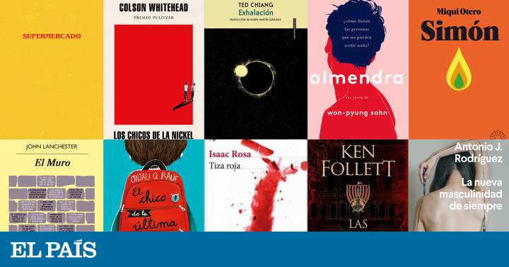
, by Bobby Hall (Today's Issues), borders on recklessness: the title, and only the title, appears on a colored surface with a disturbing and indefinite plot.
The typography is the same as that of the credits of the
Stranger Things
series
, and there all the references end.
Dispense with the author of a book on its cover is an eccentric maneuver and a calculated risk.
In this case, perhaps that void is more striking than the proper name: Bobby Hall is a new author who has not wanted to sign as Logic, his pseudonym of rapper and music producer.
By contrast, Ken Follett's new novel,
Las tinieblas y el alba (
Plaza & Janés), is shown to potential readers with all the sincerity of a best-seller.
Ingredients: the name of the author larger than the title of the work;
a venerable typeface (Trajan,
1989
revival
inspired by the inscriptions on the Trajan Column in Rome);
a background of voluptuous but undefined architectural illustrations that could be used in this novel or anyone else like that.
The cover equivalent of a subway tunnel: it's dark, solid, and similar to many other tunnels, but it takes you where you want to go.
A sad feature of the books in our country is that the most original covers are usually more or less modified versions of their original editions in English.
This was the case of
Supermercado
, which indicates that the violation is only contemplated when there is precedent.
It is also the case of another of the books of the season,
The boys of the Nickel,
of Colson Whitehead (Literature Random House).
The illustration is, in its simplicity, brilliant: the striking red and the small figures that unbalance the composition already speak of characters who live on the margins.
The original design for the US edition is by Oliver Munday, one of the masters of the genre (I recommend taking a look at his
portfolio
).
The almost identical Spanish version does not include the typographical subtleties of the original and provides title and author somewhat crudely.
The Boy in the Last Row
, by Onjali Q Raúf (La Galera), is another example of an adapted cover.
If the original illustration of a child and a backpack has all the charm and practicality (a great surface to arrange the title), translating into Spanish is a nightmare for any designer: the gaps are what they are, and the words have the length they are, and you have to do a twisted graphic gymnastics to adapt them to each other.
On the cover of
The Wall
, by John Lanchester (Anagrama), there is a certain risk.
The design is the same as always (author in Gill Sans typeface, title in false italics, yellow background), but includes a literal wall made of blocks of color.
The text that runs through the ashlars of the wall like tiny graffiti is striking for the unexpected.
An idea that loses strength as continuity suffers with color changes and because, seen from a distance, it adds an unstable noise to the composition.
The cover of
Simón
, the return of Miqui Otero (Blackie Books) wins precisely because of its cleanliness.
It also respects the publisher's typographic codes, but the choice of colors does not go unnoticed in the distance, and the small illustration in the shape of a flame (or teardrop) has a magnetic simplicity, forceful, unappealable.
Design with objects is one of the most traditional graphic schools in Spain, built on the shoulders of the thousands of covers created by Daniel Gil for the Alianza publishing house.
Red chalk
, by Isaac Rosa (Seix Barral) bases its appeal on the unexpectedness of an explosion: the shattered chalk that rises like a rocket has enormous graphic dynamism.
Notice one detail: there are two
fillets
- that's what the stripes are called in designer language - that underline title and author.
The lower one, covered by chalk.
The upper one, covering it slightly.
That little trompe l'oeil adds depth to the game.
The life told by a sapiens to a Neanderthal
, by Juan José Millás and Juan Luis Arsuaga (Alfaguara), faces an interesting graphic challenge: how to overcome the number of letters imposed by double authorship and the long title.
Spoiler
: it doesn't get it, and maybe it wasn't possible to do it.
Joining two contradictory objects in a photographic composition is one of the most
Danielgilistic devices
one can think of, and the resulting graphic poetry is almost always effective.
The fusion of a light bulb socket and a flint tip has an immediate effect as the former is a universal metaphor for the concept "ideas", and the latter is situated in an easily recognizable time frame.
For its part,
Mengele Zoo
, by Gert Nygardhaug (Captain Swing) also plays at the union of images: the butterfly, the vegetal, the dripping.
It is an attractive graphic idea that fails as long as it does not brake in time: if the illustration already has a point of excess attractiveness, the title is composed of a design code that is not easily related, and that takes away its prominence.
The Thunder in the Realm
(Destiny) is the third part of the trilogy dedicated to Thomas Cromwell by the writer Hilary Mantel.
There's a fascinating detail on that cover: it looks like a classic painting, but it's a photo.
This misunderstanding adds play to the graphic proposal.
On the other hand, she imitates her two preceding novels in one thing: the three cover a figure in the foreground, a concession to continuity and coherence.
The cover of
Exhalation
, by Ted Chiang (Sixth Floor) produces some vertigo.
The image is very simple chromatically, and the color of the upper band matches that of the image, a detail of elegance.
The sky full of stars, and a void in the center in what looks like the corona of an eclipse has a magnetic effect, like a dark pupil that observes us.
Finally, two figures with their backs that work.
The illustration by @byisabel representing
Almond
(Won-Pyung Sohn, Today's Topics) has a curious force that probably lies in its being to the point: three colors, few strokes.
Even the text that occupies the hair, an excess I suppose necessary to sell the book, is correctly compensated.
For its part,
La nueva masculinity de siempre
, by Antonio J. Rodríguez (Anagrama) uses a body photographed with very natural lighting, and is a detail that brings the cover closer to reality.
The typography is simple, clearly arranged.
There are not many artifices on this cover, and that may be the point.


/cloudfront-eu-central-1.images.arcpublishing.com/prisa/CCC42XRXIFAABOWMHO4KH3D7DU.jpg)

