Faced with a new wave of covid-19 cases, the internal mobility of each country divides Europe in two.
There are places where people move almost the same as before the pandemic, as is the case in most regions of Spain, France, Poland and the Scandinavian countries, according to Google data.
Other countries, however, are limiting their movements much more severely: throughout the UK, in Portugal, Italy, Greece, around Paris and in much of Germany, the level of mobility is practically half of what It was in January 2020, in times of
old
normality.
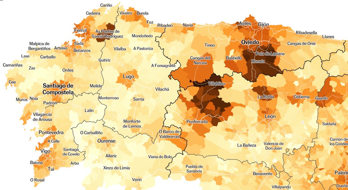
The following map shows the movements of the inhabitants for 800 regions of 20 European countries at the end of March of this year, according to the analysis of EL PAÍS of data that Google, from millions of geolocated devices.
The data offered by Google estimates the movement of the population of each region from the locations of your mobile phone, classifying the movements into categories.
To summarize, the average of three trips has been taken: to the workplace, for leisure (to restaurants, cafes, museums, cinemas ...) and for transport (to train, metro or bus stations).
Mobility is expressed in comparison with the normality of the place: a value of 100 means that the trips are the same as in January 2020;
a value of 50, that mobility is half.
Measuring mobility is useful: from what is known about the virus, a higher level of movement is related to more contacts and a higher risk of infection.
It was seen during the first wave, with the Christmas holidays or the autumn bridges, as indicated by the work of the Computational Biology team of the Polytechnic University of Catalonia.
On the La Mercè bridge in September, for example, they found that increased mobility triggered infections.
Four weeks ago in Spain mobility was seen to rise and now the rebound is seen.
It has been estimated that strict confinement can reduce transmission by up to 80%, and a study from the University of Oxford highlights three measures to reduce infections: closing universities and colleges;
close bars and restaurants, and limit meetings to a few people.
Comparisons of mobility between regions should be taken as an approximation and Google advises against "not comparing changes between regions with different characteristics", such as rural and urban areas.
But they are important data because they allow you to measure trends.
The evolution of mobility, a reflection of restrictions
The trend in Europe since January has been to maintain limited mobility.
This has been the case in the United Kingdom, Portugal, Austria, Greece, or the Czech Republic, where 60% of what would be normal mobility is now recorded.
In Italy, after the cases rose, the new restrictions have reduced activity even more: in Rome they have gone from having 70% of their normal mobility at the end of February to having only 50% in the last weeks of March .
Spain is now one of the countries closest to its pre-pandemic normality.
In fact, one of the three European regions with the most relative movement is Huelva: the displacements are 90% of the usual before the pandemic.
Many provinces are close to those levels and that is why the map looks almost all blue, with exceptions such as Alicante, which suffered one of the worst third waves, and Barcelona and Madrid, which will be discussed later.
They are also at the blue level, of a certain normality, most of France - but not Paris - a situation that should change soon after the announcement of the closure of schools in the next three weeks after months with practically saturated hospitals and ICUs.
The dilemma is similar to that of Germany, which these days has considered tightening its restrictions due to the increase in cases.
There, activity fell in January to levels similar to those in Spain, and later returned to normal in February and March in a de-escalation process.
Other countries with relative normality are Poland, Croatia or Romania, and also the Nordic countries, although there it is possible that the comparison with January 2020 is delicate, because it was the harshest of winter.
Evolution of mobility in Europe since the start of the pandemic.
The data shows a recent mobility trend in many cities.
As the examples of Valencia, Madrid and Barcelona show, in Spain mobility has been increasing for three months and exceeds 70% of the usual in January 2020. The contrast is evident with Milan or Rome (60%), for example, where the Mobility has been drastically restricted in recent weeks, after a strong spike in infections.
In other capitals, mobility is not reduced, but it is at lower levels than in large Spanish cities, as seen in Brussels, Paris or Berlin (60%), and even more clearly in Lisbon, Oslo or London (50%) .
More change in big cities
The map highlights a pattern that can be seen in the large cities of the continent: the majority have seen mobility reduced more than what is normal in them, in contrast to less urban areas of the same countries.
It is something that is observed in London, Paris, Berlin, London, Oslo, Stockholm, Prague, Warsaw, Milan, Turin and Lisbon.
In Spain, this phenomenon is evident in Madrid and Barcelona, which have a mobility 10 points lower than in Guadalajara, Cuenca, Lleida and Tarragona.
On the one hand, we know that in large cities there are usually more movements, so that the current abnormality implies a greater change there.
It is possible that in some cities - such as Paris - extraordinary restrictions have been imposed, because their contagions often grow faster.
Many other factors can influence, but one that seems fundamental is work.
Google data allows us to see mobility by activities and large cities stand out because they have very intensely reduced movements to workplaces.
In cities there are more jobs where teleworking is simple, such as the banking sector, consulting and technology companies, communication companies or public administrations.
Madrid and Barcelona have reduced trips to work to 75% and 78% of the usual, more than anywhere (except Melilla), while in the rest of the provinces they have only done so to 80% or 90%.
There are extreme cases: in Oslo these trips are half of the usual, although in the rest of Norway they are 70% or 80%.
Stockholm is also the region with the least labor mobility in Sweden;
Berlin and Hamburg are in Germany and Paris in France.
On the other hand, trips to bars, cafes or cinemas are somewhat more homogeneous in Italy, Spain or France.
Search engine
.
In the following you can see the evolution of mobility data in most regions that we reflect in the map above.
Methodology and sources
Mobility data
.
All the data comes from the local mobility reports on covid-19 published weekly by Google.
The information estimates the movement of the population of each region from the locations of your mobile phone, classifying the movements into various categories.
For the map and the main graphics we have taken the average of three types: (1) trips to the workplace;
(2) for leisure (restaurants, cafes, museums, cinemas ...);
(3) by transport (train, metro or bus stations).
These levels are expressed in comparison with the normality of each place: a value of 100 means that the displacements are the same as in January 2020, and a value of 50 indicates that there was half the mobility.
The evolution of mobility is related to spikes in contacts and infections.
However, comparisons between regions should be taken as an approximation and Google advises "not to compare changes between regions with different characteristics", such as rural and urban areas. "
Map
.
We have prepared the map of regions of Europe from the regions for which there is Google data, which are not homogeneous administrative levels.
The main regions are the NUTS statistical units.
We have used level 2 for Austria, Belgium, Denmark, Holland, Latvia and Poland;
and level 3 for Bulgaria, Croatia, Slovakia, Spain, Finland, France, Hungary, Italy, Lithuania, the Czech Republic, Romania, Sweden and Switzerland.
For the rest of the countries we have used maps with different administrative divisions.
/cloudfront-eu-central-1.images.arcpublishing.com/prisa/RIEGNR2BRDHJGVEUXQK5ZTXPMI.jpg)
/cloudfront-eu-central-1.images.arcpublishing.com/prisa/UYLPTY4TSGK24P5UXIFTOYDPNI.jpg)
/cloudfront-eu-central-1.images.arcpublishing.com/prisa/LEW6QMWWHNE5FNIE3XEQGWJXMQ.jpg)
/cloudfront-eu-central-1.images.arcpublishing.com/prisa/BSW76ADTMZBGXEN5B5THLU2R7M.jpg)