Home and design
news
And here's the forecast: going to be deep blue with a touch of cinnamon
The trend forecast for 2021 marks one dramatic color that is going to stand out in particular, alongside the earth colors that will continue with us from last year.
And also: how to choose the right color for the space that will not be an 'energetic vampire' and will draw all your strength from you?
Tags
Color
Trends
Walla!
Home and design
Tuesday, 06 October 2020, 08:30
Share on Facebook
Share on WhatsApp
Share on general
Share on general
Share on Twitter
Share on Email
0 comments
Next year will be colorful.
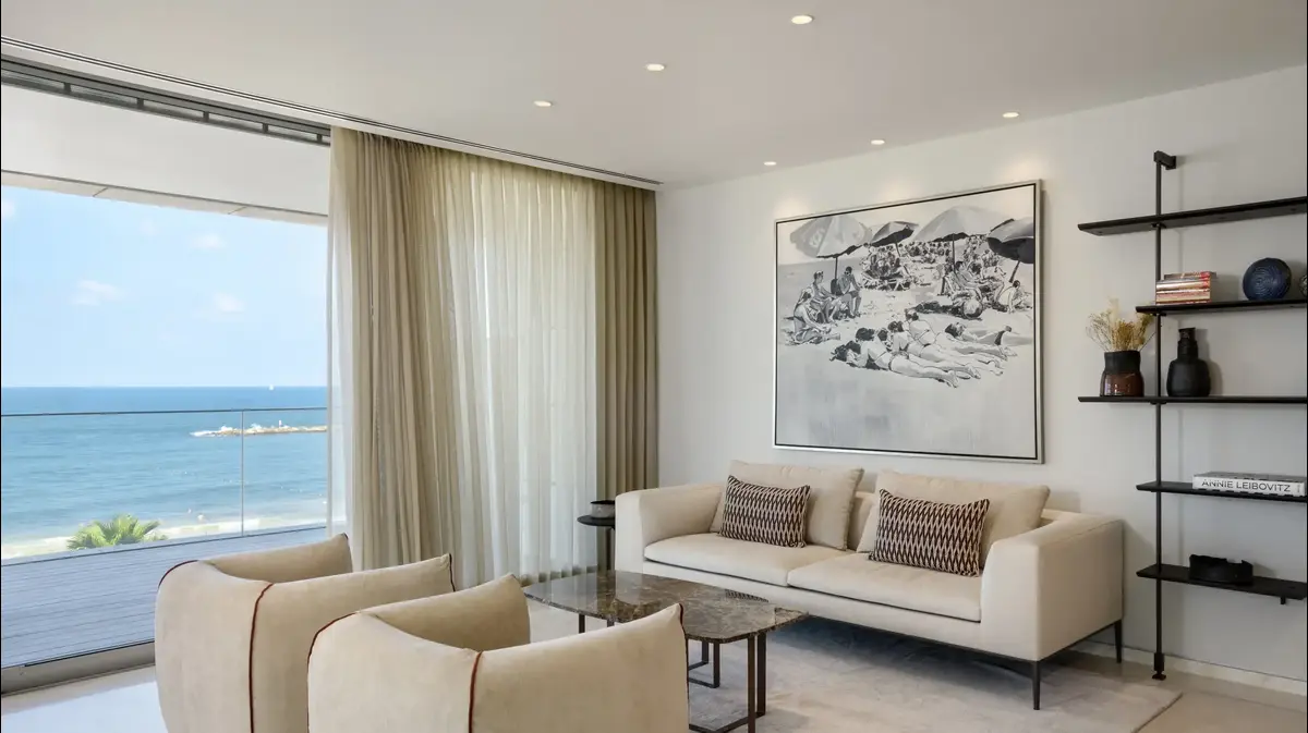
Sigalit design for Biav, graduate of the Barbara Berzin Interior Design School (Photo: Sivan Moyal)
If you too have been feeling a little down lately and your mood is not something, that's fine - you're not alone.
The second closure and the corona that refuses to dissipate are an excellent trigger to disconnect "from the here and now" and catch up, earlier than usual, on the trends and trends that await us in the next civil year, which in contrast to the gray gloom of 2020, is going to be particularly colorful.
More on Walla!
NEWS
Biophilia: Meet the new trend in luxury homes
To the full article
It seems that the various international design houses and brands have internalized the spirit of the period and realized that what we all want and need to raise morale is a shot of color: according to leading trendologists and prominent international design sites, 2021 will be one of the most colorful years ever.
As it seems at the moment the color will take over not only the walls but also the furniture items, the lighting fixtures, the textiles and the accessories.
There are colors that can be energetic vampires.
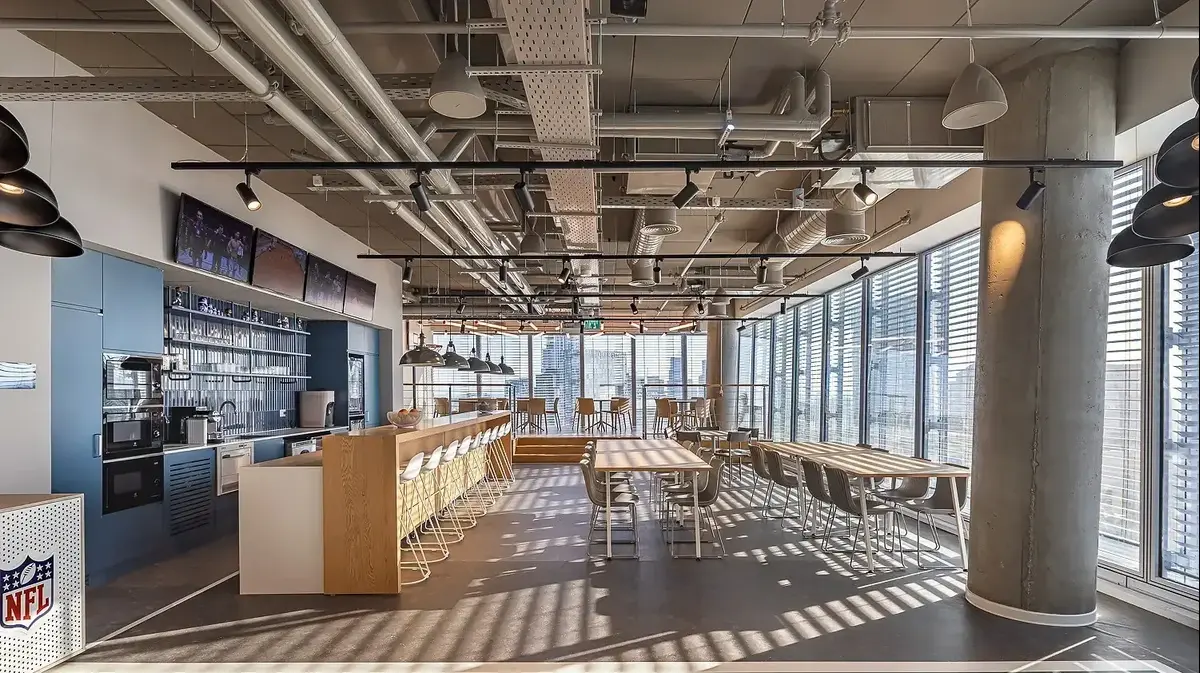
Design Adi Erel, graduate of the Barbara Berzin School of Interior Design (Photo: Shai Epstein)
According to Barbara Berzin, an interior designer and owner of an interior design school, “We are not always aware of this but the colors we choose for our home have a tremendous impact on our feelings and energies.
Beyond its visuals it affects us psychologically for everything: the personal mood and the dynamics between family members - some color can fill us with happiness and serenity while another is an "energetic vampire" for anything that may pump the energies and put the household into black bile, so very important Choose the colors in a balanced and considered way.
"Every shade is in fact an electrical frequency that is absorbed in our brain, and activates different areas in it, so we are affected by diversity in each of our levels of existence - the psychological and emotional level alike."
The color does not have to be reflected on the wall.
Elita Living armchair (Photo: PR abroad)
According to Berzin, color does not have to be reflected only on the wall: "You have to exercise judgment and understand how much we want the color to dominate the space and in what way, not everyone likes their house to convey a theatrical and bold atmosphere and it is completely understandable. Neutral and quiet - Color companies today offer an almost endless variety of shades in their fan of colors so you can find worthy substitutes for the standard white that also subtle in them add a dimension of warmth and depth to the space.While the shell remains classic and neutral begin to build the tone space on top. Gradually tone from the lighter shades to darker, in a technique called degradation. Thus, the large furniture that has a mass is recommended to choose a slightly darker color and most of the drama and formal richness is produced with accessories such as accessories, art, pillows and textiles - there you can also dare textures and patterns. To maintain balances that did not create conflicts. "
Blue rises
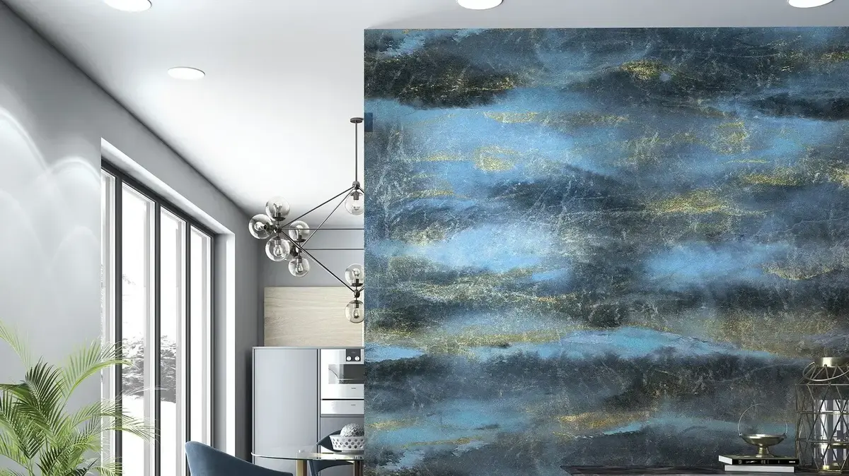
If you rely on the experts and trendologists in the world, the color that will stand out among all the bright colors that await us in the coming season is a shade of blue called NAVAL, created by the American color giant sherwin-williams.
This is a shade of extra dark blue that some define as the new black.
It is elegant and up-to-date and although it has a very strong and powerful presence it is likely that we will see it also used for painting entire spaces.
A powerful and elegant presence.
A space designed in deep blue tones (Photo: Goldstein Gallery, PR)
According to Renana Azoulay, Elita Living's Customer Relations Manager, alongside the NAVAL blue, other dramatic and intense shades will stand out that seem to be combined with key and prominent elements in the home space such as textiles, accessories, furniture details and lighting fixtures: "The colors are very diverse. The design is such daring. On the one hand we see the gold, brass and black, and dominant colors like light blue, blue, orange and green in the acceptance and on the other hand also lots of items in pastel colors. To the colorfulness is added the texture that only intensifies and emphasizes the object. Prominent that is taken from nature, but in the more prominent and daring version. "
"For years the design houses have not shown such daring."
Elita Living (Photo: Overseas PR)
There are also shades that have not exhausted themselves in 2020 and will therefore continue with us into next year, such as the trend of warm earth colors.
"We see an abundance of wallpaper and wall coverings in spice colors in shades such as turmeric, cinnamon and paprika - red, orange and brown which are an excellent anchor for furniture and wood, straw and rattan details that also stand out in the new collections," says Sarit Goldstein, Marketing Director at Goldstein Wallpaper Gallery.
"The items are more textural, so for example the wallpapers are made of natural materials like jute and linen that create a multi-dimensional and rich look without taking over the space."
Wallpapers made of natural materials with a prominent texture that creates a multidimensional and rich look (Photo: Goldstein Gallery, PR)
Share on Facebook
Share on WhatsApp
Share on general
Share on general
Share on Twitter
Share on Email
0 comments

