Amazon presents 3 products that you may not be able to buy 0:58
(CNN Business) ––
Amazon quietly changed the design of the new icon for its app.
The company replaced the blue ribbon at the top of the image which generated some unfavorable comparisons.
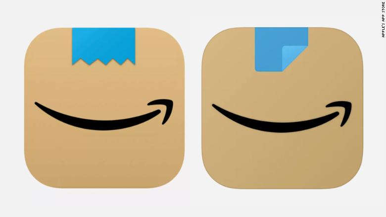
Users of the Amazon Shopping app will now see a brown box, which resembles a package, with a blue stripe that looks like packing tape over the brand's signature smile arrow.
Parler sues Amazon for canceling the app's hosting service
Amazon introduced the first new icon in a few international markets in late January.
But, he recently changed the design of the blue ribbon, after some said it resembled a toothbrush-shaped mustache, similar to the one Adolf Hitler wore.
"I didn't realize that Amazon quietly modified its new icon to look ... less like Hitler," Alex Hern,
The Guardian's
technology editor, wrote
on Twitter.
The first new icon is on the left, the update is on the right.
The new icon was Amazon's first design change in more than five years.
It replaced the shopping cart and removed the word "Amazon."
But it shows the company's smiley arrow logo more prominently.
The blue ribbon appears to be torn off, as if the package is being opened.
“We designed the new icon to generate anticipation, excitement and joy when customers begin their shopping journey on their phone.
Just like they do when they see our boxes on their doorstep, ”said an Amazon spokesperson.
The app icon was modified based on user feedback.
advertising
Only iOS users in the UK, Spain, Italy and the Netherlands saw Hitler's similar design in recent weeks.
The updated icon was released worldwide for iOS users last week.
Android users will see the new look starting this week.
Amazon