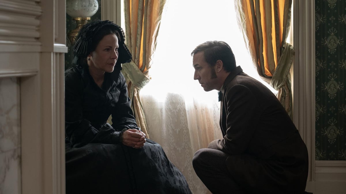
At first glance, one could almost think that the way in which the cartoonist Philippe Berthet was approached to work with Jean Van Hamme on
La Fortune des Winczlav
resembles the sequence of the film
The Godfather
of Coppola:
"I am going to make you a proposal that you will not be able to refuse! "
When the publisher José-Louis Bocquet contacts the author of the
Pin-up
and
Hollywood Private series
to ask him to work on a project related to Largo Winch, Berthet is at first a bit taken aback.
Read also:
The Fortune of the Winczlav
: discover the fabulous fate of Largo Winch's ancestors
“I admit it,”
he recalls, “
I was a little in shock.
I was invited to take part in a saga like that of Largo Winch.
At the start, I even feared that they would want me to “
walk on the flowerbeds”
of designer Philippe Francq.
When I read the script for Jean Van Hamme's first volume, I was completely reassured!
It was about telling the origins of the Largo Winch empire by focusing on the ancestors of the humanist billionaire.
I was assured that I would retain graphic control over the entire trilogy.
So everything became clear. ”
A stimulating project
Very quickly, Philippe Berthet understood that the challenge was going to be exciting.
He who rather draws the America of the twentieth century, this time, he is asked to dive into Central Europe of 1848, from insurrectional Montenegro to America.
“Even though this project took me far from my basics, it was stimulating,”
he admits.
With the help of my partner Dominique David who patiently gathered all the historical documentation, I was able to take the plunge. "
“In
The Fortune of the Winczlav
, the story moves forward at an incredible speed,” he
emphasizes.
We never have time to be bored.
I loved feeling the epic breath of this soap opera saga à la Alexandre Dumas!
"
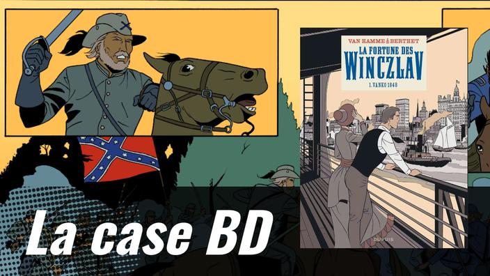
THE BD BOX:
Philippe Berthet: "I wanted this plate to be like a summary, a concentrate of savagery ... like an allegory of the Civil War."
© Éditions Dupuis
Page 30 of the album (therefore plate 28) is centered on an evocation of the Civil War.
Philippe Berthet tells how the screenwriter Jean Van Hamme trusted him in the design of this board.
“
When I discovered the script,
says Berthet
, the page was blank!
Jean said to me: “
Take care of yourself ... I'll give you carte blanche”
.
I told myself that it was a real graphic and narrative challenge.
Four years of conflict had to be summed up in one page.
With the help of my partner, we did a lot of thinking.
I wanted this plate to be like a summary, an evocation of the war, a concentrate of savagery ... like an allegory of the Civil War.
And all this, without a bubble!
"
In these two superimposed panoramic boxes, the Yankees oppose the Southerners.
© Éditions Dupuis
First of all, the designer designs two superimposed panoramic boxes.
“I had 7 boxes in all and for everything
,” he explains.
I had to start by presenting the two camps: the Unionist camp on one side and their blue uniforms, and the Confederate camp on the other, in gray.
The use of these two boxes in cinemascope gives a grandiose side to the action.
"
This vertical box shows the melee confrontation between the “Blues” and the “Grays”.
© Éditions Dupuis
Once the presentations have been made, Philippe Berthet concludes the first strip with a vertical box which symbolizes the confrontation.
“After showing the opposition, thanks to gunfire, this vertical box gets into the heart of the matter
,” he analyzes.
There, we are in the clinch.
The "Blues" against the "Grays"! "
This box in the shape of a war fresco clearly highlights the opposition between the two flags, on one side the “The Stainless Banner” of the Confederates, and on the other, the starred banner of the Unionists. which became the American flag.
© Éditions Dupuis
The following sequence plunges readers into the heart of the battle.
“I wanted to design a war fresco made of noise and fury,”
says the designer.
I have arranged three inserts in the table.
I wanted to get closer to the protagonists, as if they were close-ups.
This humanizes the sequence.
"
You see, we did better than Les Tuniques Bleues!
In their series, they have been telling about the Civil War for 50 years, while we have summarized it in one page!
Jean Van Hamme
In the second part of the plate, we measure the degree of violence of the Civil War.
“Death is very present on this page,
agrees Berthet.
This is an armed conflict.
It's violent.
And it has to be felt!
That's why I put a dead horse in the foreground.
And that the last insert shows a bloody box where we see the decapitated Northerner soldier.
"
Philippe Berthet concluded:
“I had a bit of pressure on this board.
I sometimes had the feeling that it was a poisoned gift.
But finally, when Jean saw the finished board, he told me: “
You see, we did better than
Les Tuniques Bleues
!
In their series, they have been telling the story of the Civil War for 50 years, whereas we have summed it up in one page! ”
This is a beautiful exercise in synthesis, magnified by the stylish lines of Philippe Berthet and a sharp sense of composition.
Flip through the first pages of La fortune des Winczlav Tome 1 - Vanko 1848