
Home and design
The tenants asked for "something in the middle" and received much more than that
A couple bought an old-fashioned, dark and closed house and wanted to redesign it with a look that would not be "too much": not too trendy, not too black, not too white ... How did it end up with a house that is wow?
View photos
Tags
exterior design
renovation
Renovations
Walla!
Home and design
Thursday, 19 August 2021, 06:05 Updated: 07:36
Share on Facebook
Share on WhatsApp
Share on general
Share on general
Share on Twitter
Share on Email
0 comments
The project:
A house in the center of the country The
tenants:
a couple + 3
Size:
240 sq.m.
Design and planning:
Odelia Barzilai
A couple of parents in their 40s and their three children searched for the dream house, and found what they were looking for thanks to the creativity and vision of designer Odelia Barzilai. 25 years old, old-fashioned, but with a lot of potential.
"It was very dark, with an old-fashioned, closed kitchen and bathrooms," Barzilai explains.
More on Walla!
No noise and ringing: private house with a clean and classic style pool
To the full article
You need to know how to choose both the right property and the designer who will accompany the project.
Living room in a renovated private home in the center - Design: Odelia Barzilai (Photo: Gilad Redt)
It was a major renovation that included the entrance floor, the bedroom floor and the addition of a master suite in the attic (Photo: Gilad Redt)
The list of tenants' requirements included: lighted, ventilated and warm spaces, and a sense of space.
"The customers wanted the house to be neither too white nor too black. Something in the middle, with a combination of warm materials and different styles," explains the designer.
Barzilai notes that in her work she makes sure that the house always reflects the character of its owners and occupants, and so does this project.
The redesign included extensive renovation work on the entrance floor, on the bedroom floor as well as the renovation of the attic and its transformation into a luxurious master suite and spectacular in its beauty.
The room floor has been expanded and now has three bedrooms, a large family corner, two bathrooms and a spacious laundry room.
"They asked for a dream home - and I think the result certainly speaks for itself," Barzilai smiles.
Decorative lighting fixtures above the dining area (Photo: Gilad Redt)
The living room is equipped with an abundance of soft and pleasant textile items (Photo: Gilad Redt)
Makes an entry
"The original plan included an entrance hall to the house that demarcated the kitchen area," Barzilai explains her decision to break the wall and thus open - in all respects - the kitchen area and entrance to the house.
“The wall that was there created a dark entrance, and even though it was practical, we had to undo it and create it in a different way,” she says.
At the entrance to the house is a beautiful mirror. This is the designer's favorite item: "I remember the first time I entered the house I knew that this mirror would be placed on this wall."
Spacious family corner on the second floor (Photo: Gilad Redt)
The living space, which includes the dining area, was enlarged, but a constructive pillar remained, which was a constraint.
"We were debating whether it would be right to break and open up this area, thus highlighting the presence of the column, but it was clear that this was the only way to increase the space," she says.
"These are constraints that happen many times when enlarging the house. In most cases I manage to incorporate and embed the pillar in the walls, but in this case, because the pillar is in the center of the space, it was not possible to hide it," she adds.
And despite the constraint, the remaining pillar leaves a large and spacious space around it, and does not interfere with the conduct and flow in the room.
"To obscure his presence in the space I highlighted other elements, and I designed a uniform and homogeneous façade that faces a beautiful garden," notes Barzilai.
Separation of forces
The original design of the house divided its various spaces into areas.
On the entrance floor there is a kitchen area that is detached from the living room area, a dining area, the living room area, guest toilets and another room designed for the children as a play area and lessons.
This is the "warm" area where the family stays and spends most of the day together.
Barzilai made sure that every area in the house would receive the respect it deserved, despite the openness and renewed space of the space.
In the living room, for example, the same constructive pillar was harnessed and became an elegant divider between the living room and the dining area, with a separation that becomes more accessible and friendly than a blocking wall.
The original design included a support page that could not be removed or concealed.
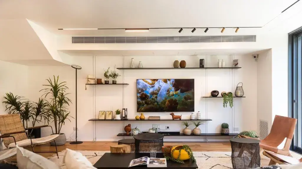
TV wall in the living room (Photo: Gilad Redt)
Rectangular metal table with decorative items (Photo: Gilad Redt)
The kitchen area has also been enlarged and expanded. "In the original plan, it was a little more closed and there was a pantry next to it," Barzilai explains. The pantry wall was removed, and the beam that remained on the ceiling was hidden behind the plaster lowering. A storage room located next to the kitchen has been converted for the benefit of a pantry and the creation of additional storage space as well as an additional refrigerator and freezer. A balanced combination of dark and light shades creates an inviting and pleasant look to conduct. "I chose a harmonious combination of shades. "A light coffee color, and a contrast in a dark shade, such as a work surface in black, a dark cucumber and integral handles in a darker shade to emphasize and give an elegant look," Barzilai explains.
A wide island 3.5 meters in size and surrounded by chairs, allows you to enjoy company while cooking, or sit down for a light meal with the whole family.
A surface made of porcelain granite is chosen for practical reasons of heat resistance and easy maintenance, and it also contains the stove and enough space for the conduct of two or more people.
Exit to the balcony from the kitchen area allows for comfortable conduct, and also encourages many outdoor meals.
The floating library shelves are held by metal cables that are stretched between floor and ceiling (Photo: Gilad Redt)
Living space invites for a stay together
The living space has been greatly enlarged, as mentioned, and the floor is covered with natural oak parquet which gives it instant warmth.
Here, too, a combination of dark and light shades in precise doses helps to present an organic and warm space, minus the drama and darkness, and with a lot of pampering and warmth.
In the center of the living room is a large and bright sofa and is surrounded by plenty of textile items.
Mesh tables are also used for smart storage, such as winter blankets, for example.
Additional reinforcement in the form of a rectangular iron table offers comfortable handling and extensive accommodation options.
The living room is invitingly designed for conversation, with leather armchairs on one side of the sofa and fabric armchairs on the other side.
The TV wall is designed as a unique library made of thin iron shelves that seem to float in the air, and are held in place by cables stretched from floor to ceiling.
The image that hangs in the dining area was created by the designer herself, using light fabrics (Photo: Gilad Redt)
The dining area is large and inviting to sit together.
An oak table with iron legs and chairs decorated in black around it delimit the corner well.
Barzilai combined a work of art, the work of her hand, made of light fabrics and given a dark frame - which adds texture and dimension to this space.
The lighting chosen was also "harnessed" to create warmth in the space and emphasize the special elements.
Recessed lighting in wood cladding inside the lowering of the ceiling corresponds well with the parquet floor and with the decorative fixtures hanging in the kitchen and dining area.
The highlight of the renovation.
The master suite located in the attic (Photo: Gilad Redt)
Attic Suite
The highlight of the renovation is undoubtedly the old-fashioned attic, which was not useful in its previous incarnation. This became a separate master suite and detached from the rest of the bedrooms in the house, making it the perfect escapist stronghold for the couple. The floor is covered with oak parquet, a homogeneous background perfect for the double bed and the white closets. Soft white textile accessories soak up a sense of calm and comfort, and invite you to curl up comfortably.
"Even in this space, which covers an area of 48 square meters, there were many structural challenges, in the form of supporting pillars that could not be removed." Says that one of the couple's requirements was to provide an open and spacious space, but one that would also include separation, which would allow them to conduct themselves individually, and let one of them continue to sleep peacefully, for example, while the spouse gets organized for work.
Spacious space that allows separation when needed and wanted.
The parents' bedroom (Photo: Gilad Redt)
Barzilai has designed a number of areas that will make the best use of the given space, thus dividing the room into a closet area, with a sleeping area and an area for makeup and getting organized, next to which is the bathroom.
The partitions and separations became elegant and almost imperceptible.
Between the bathroom and the sleeping area, for example, separates a glass wall, with different degrees of transparency in favor of the required privacy.
The closet was built according to the constraints of the slopes, for maximum utilization of space and plenty of storage solutions.
Under the window, a bench was installed with shoe drawers, and a wide mirror was placed in front of it.
These help in a relaxed and efficient organization.
The bathroom is also optimally utilized.
The sloping ceiling forced the designer to move it towards the center of the room, but due to the transparent separation, the significance of the change was negligible and left it spacious.
Large white porcelain tiles with marble-like tendons.
Master bathroom (Photo: Gilad Redt)
The lower part of the sloping room was used for a bench in the shower (Photo: Gilad Redt)
Here, too, the fine materials do kindness and embody the look of a kind of room in a boutique hotel: cladding of large, white porcelain granite tiles, lightly accentuated with dark marble tendrils, and sanitary fittings and bathroom cabinet in black, for a spectacular design contrast.
In the shower cubicle, a bench was installed in the lower part of the wall, and above it was a shelf used for storing toiletries, for optimal use of space.
Barzilai emphasizes the issue of lighting, which was doubly important in this room: "Proper lighting in the space is always very important, especially in challenging areas like here," she says.
"Because the ceiling is diagonal, it is important to buy light fixtures that are adjustable and can be adjusted and faxed over the areas designated for illumination," she suggests.
Share on Facebook
Share on WhatsApp
Share on general
Share on general
Share on Twitter
Share on Email
0 comments