
There are huge brands, with a global reach, that have worked on what many proposed from home a year and a half ago, as soon as the pandemic arrived: to be the improved version of oneself. Or at least try. KFC, the American giant of fried chicken, made that version public in May 2021 through new packaging that included a more detailed illustration of Colonel Sanders, the mustachioed founder of the company, along with the name of the company to the complete, Kentucky Fried Chicken - previously replaced by its three initials -, which now appears in a typeface identical to the original from 1952.
Burger King is not the same since it launched its brand image last January, after more than 20 years without having touched a single comma of its identity. With the current redesign, the logo recovers an old one that was used from 1969 to 1998, with the name of the chain illustrated between two hamburger buns.
Looking back can be an effective strategy to underline the years that a company has survived, and a way of showing off longevity in the face of an unstable market.
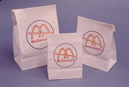
But this return to the origins is not the norm in fast food brands: in the last packages that McDonald's presented in November 2020, although they have been arriving in Spain little by little since July, it is simply appreciated what consumers will find when open bags, boxes and glasses, according to the marketing director of McDonald's Spain, Natalia Echeverría: "What we have done is a nod to the ingredients of our products."
With the new designs of its packaging, McDonald's returns to the origins and is committed to simplicity.
The bags, boxes and glasses are a nod to the ingredients of the products they contain.
The London-based agency Pearlfisher was in charge of the wink –except for soft drink bags and glasses, run by the Turner Duckworth studio-, which has designed a visual system with the elements that best define the contents of a container. So when ordering a Cheeseburger, the wrapping paper will not show the meat, onion, or pickle slices, not even ketchup or mustard, but rather the cheese slowly melting from the heat of the burger.
In the popular Big Mac, its box reflects the stacked ingredients that everyone looks at before taking a bite. The same happens in cold drinks –whose glass is illustrated with bubbles or ice, nothing more-, and in McFlurry ice cream cans –in them a tide of colors appears about to mix. For the fish burger, surprise: the container that protects it contains a sea like the one a child in first grade would draw, waves included.
"The idea was to extend the McDonald's fun times from the product to the packaging, the really good times." The chief marketing officer refers to the concept of momentary happiness with which the brand has always been associated. In the collective mindset, eating in one of its establishments is a party for both children and adults. The former love them for the Happy Meal gifts, their fries or the slides. While an adult likes it because, to be honest, a McMenu amounts to not thinking about diet, something that is usually an exclusive license of some day of the week and as such should be used and enjoyed to the fullest.
Furthermore, their corporate colors - red and yellow - are the complete opposite of sad.
The architect Stanley Clark Meston used them in 1953, long before the famous logo of the arches, when the two sons of the founder of the company proposed to him to design a roadside McDonald's that could become a franchise restaurant.
Meston drew two yellow semicircles at each end of the building, accompanied by an XXL-sized sign in red tones that announced that it had sold more than a million hamburgers.
Its objective?
Get the attention of hungry drivers, and in a very efficient way, according to the creative director of the Australian agency Brands to life, Paul Findlay.
From 1961 to 1968 McDonald's opted for a white 'packaging' with golden arches.
He explained it in 2018 on the Mumbrella web portal: “Yellow inspires happiness and positivity, and red makes us stop and look.
It also stimulates and excites us, just like when we are having a feast of delicious food.
There, our heart rate tends to accelerate and neurons fire in the hypothalamus part of the brain. "
Red and yellow are not the only tones that McDonald's has used throughout its history, but they are the ones that were always in the glove compartment when the company wanted to update itself to fit the aesthetics of each era.
And now, with the new packaging, the striking colors are what configure the shapes of the illustrations, "very simple and appetizing", describes Echeverría, "and created based on minimalism."
There are no more ornaments or flourishes, and drawings are reduced to the minimum expression, as many international companies have been doing for years, especially within sectors such as technology and luxury fashion.
This trend, called
blanding
, consists of simplifying the brand image: out of convoluted shapes and complex color schemes, goodbye to decorated typefaces, hello to
sans serif fonts
(
sans serif
, without
serifs
or
serifs
).
Simplicity, a way to optimize efficiency
With the exception of the
packaging
that McDonald's used from 1961 to 1968 –white and with the golden arches–, the company has not bet on minimalism in its packaging for decades.
It can be seen in the redesign that the Boxer UK agency devised in 2009, in which the products were photographed as is.
Echeverría remembers: “What we needed as a brand at that time was to change the perception of McDonald's, that idea of a fast food chain.
We wanted to focus on
good food
, served
fast
.
Hence, the menus were displayed in all their splendor ”.
In 2011, the fast food chain's products appeared surrounded by drawings on bags, glasses and McFlurry ice cream jars.
“Apart from raising the image, the company sought to differentiate itself from the rest of the fast food chains”, considers Fernando de Córdoba, brand, content and narrative strategist. “McDonald's was intended to be a family place, a place, I will not say elegant, but a little more sophisticated than before. That is why in Europe the corporate identity became green, replacing the red that did remain in the United States. And the same with restaurants ”, he points out. “They stopped being the school cafeteria with prefabricated walls, and began to be filled with wood and natural materials. In addition, in the
packaging
all the ingredients were represented with realistic images except the chicken, so that McDonald's was not related to consuming animals ”.
The products, also at their best, were surrounded by numerous drawings on the bags, glasses and McFlurry ice cream jars launched in 2011, also designed by Boxer UK, with the intention of highlighting the flagship drink and dessert of home. By 2016, all traces of food disappeared, although, yes, the containers were covered with the names of the dishes written in huge fonts, the work of Hothouse Collaboration in collaboration with Boxer UK, which were changed in size to give the feeling of dynamism.
Nothing of the last identity has been preserved in the one of now, whose aesthetics is supported by the visual line that the brand has adopted in its different expressions. "You can see it in the advertisements and in the POS (advertising at the point of sale): red and green lose importance as a support color, while yellow begins to star in everything in combination with white", says Fernando de Cordova. With the new
packaging
reduced to a minimum, the company has gained clarity, making a product identifiable without having to read or look too much.
In fact, this is one of the reasons why
blanding
has been so successful. For a brand that receives millions of
online
orders
per day, the digital channel is vital, and the clean lines and flat 2D figures are perfectly suited to it: when reduced to the size necessary to be displayed in a
mobile
app
, they are still recognized the same than in a marquee.
The Pearlfisher team, responsible for the new design, speaks about efficiency in an interview for the Packaging Europe portal: “That McDonald's packaging is easy to understand is important.
And not only for the customer, but to ensure that they do not add any complexity to the staff who prepare the orders in the restaurants ”.
Specifically, in the 39,000 that the company has distributed in 2021 throughout 100 countries, with several alphabets and cultures very different from each other.
In 2016, all traces of food disappeared from the containers.
Instead they were covered with the names of the dishes written in fonts that changed in size to give the feeling of dynamism.
Another way to gain trust
"The new packages are ingenious, they express a lot with very little, but at the same time they follow a very obvious trend that makes McDonald's lose its differential value a bit," says Fernando de Córdoba. For him, even so, the company has known how to keep its distance from its competitors: “You have to bear in mind that Burger King is the second in the United States, the challenging and hooligan brand that is constantly messing with McDonald's to gain relevance, because it is the leader of the category, and that is appreciated in its more mature and calm position ”.
As an example, the brand strategist not only mentions the new
packaging
of the two companies, but also the way in which both are dealing with the fast food crisis.
"Burger King seems to shy away from the subject with that of 'I don't get involved in whether I'm healthy or not, the only thing I'm going to tell you is that I'm very rich.'
McDonald's, however, emphasizes that it uses fish, fruits, fresh things, and reminds us that we can trust it because it is a traditional brand that has always been there, by our side ”.
In short, a different formula than that of going back to the past by recovering a logo, although with the same objective: to transmit history, permanence and company in a decade of radical changes and a lot of uncertainty.

/cloudfront-eu-central-1.images.arcpublishing.com/prisa/6YCPB3COKFHPZIDIWESDJRX7CE.jpg)


/cloudfront-eu-central-1.images.arcpublishing.com/prisa/BUA2NNBCCBACHEPXXR6NIRKCA4.jpg)