
The books on the tables of a bookstore are like animals in a natural environment: their covers shine in freedom, and the impulse to caress them, open them, leaf through them is inevitable.
On screen, by contrast, they are like bugs in captivity: caged, small and fuzzy, often lost in the crowded design of a virtual store.
That slightly nostalgic affection for paper books and their glossy covers does not prevent it from being in the digital environment, sometimes hostile, where the covers fulfill their function best as an image, sales and
marketing
tool
. At this point it is a no-brainer: the pixel book reaches an audience that multiplies the capacity of all bookstores, and the covers amplify their reach when they appear on social networks, on the
publishers' own
websites
, in newsletters, bibliophile pages or compilations like the one in this article.
That said, in Spain tens of thousands of works are published every year (in 2019, 21,895 new titles of “literary creation” were launched, according to the Ministry of Culture).
Choosing a few "best covers" from that endless ocean of proposals is a somewhat arbitrary and unfair exercise.
One can hope, at best, that the sample, necessarily brief, is representative of the best in editorial design.
And why admiring the covers of these books makes us want to immerse ourselves in their pages.
Barret
Ant world,
by Charlie Kaufman (Barret).
The intricate and surprising illustration tells its own haunting story: gut-textured tunnels inhabited by a lonely, schematic ant.
The title is split and asymmetrical, and that misleads a bit: using hyphens is a design license that sacrifices readability but adds surprise.
Illustration by Isidro Ferrer.
Fulgencio Pimentel
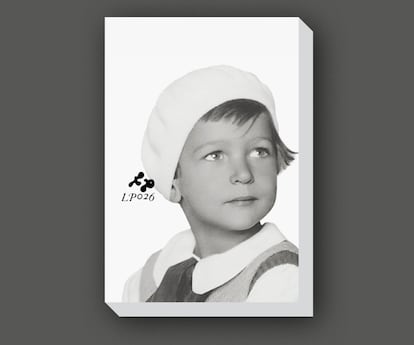
The parrot of Budapest,
by André Lorant (Fulgencio Pimentel).
The author of this autobiography himself stars on the cover, naked in title or signature in a gesture of graphic radicality that adds interest and intrigue.
The look goes out of the plane, I don't know if looking at the past or the future, and there is something intriguing in those childish eyes full of sadness.
The subject of the book: Lorant's childhood and youth in Hungary, first under Nazi rule, then communist.
Design by César Sánchez.
Anagram
Curved time in Krems
,
by Claudio Magris (Anagram).
It is impossible for the personality of a specific cover to stand out above the yellow of Anagrama, which is the most identifiable "collection" design in Spanish bookstores, and which has been fixed in our literary imagination for decades.
The skill of this cover is that it doesn't try to get over color;
on the contrary, it merges.
The yellowish water transmits both peace and a slight movement of a suspended instant.
Illustration by Diane Parr
Ariel
Solo integral,
by Fernando Savater (Ariel).
There is vertigo and imbalance on this deck.
Internal movement, action.
And two graphic styles (photo, on the one hand; masses of flat color on the other) that could speak at the same time of reality and abstract thought.
It is interesting how an apparently ungainly composition is actually based on a complex grid: the child's foot is resting right on the vertical half of the cover, the lower title resting on a quarter, the diagonal that starts just from the upper middle point, etc. .
This book is part of a collection dedicated entirely to the author, and all the covers share typography, style and a few small glasses in the upper right corner that are Savater in ingenious synecdoche.
Design by Planeta Arte y Diseño / Miriam Rodríguez.
Hurtado and Ortega
Vulcano,
by Max Besora (Hurtado y Ortega).
This cover exudes violence, chaos, evil.
The brush-drawn letters are all movement, and the red on black has something hypnotic that is especially appreciated in its paper version: the letters are printed with silkscreen, volume and gloss.
It's hard to resist running your fingers over it.
Illustration by Nino Cabero.
Blackie books
Subidón
,
by Joaquín Reyes (Blackie Books).
This is actually a fairly basic design cover: the publisher's typical fonts and a color choice (orange on green) that challenges the colorblind.
But it is also an extraordinary cover because it has two plastic eyes that peek through the cardboard, shake as we grasp the book and provoke an inevitable smile.
It is not seen on the screen;
go to the bookstore.
Setanta design.
Pocket-size
1984,
by George Orwell (Debolsillo).
Everything on this cover speaks of totalitarianism: a watchful eye, angular and aggressive typography, color codes that refer to the Russian constructivism typical of the early days of the USSR.
Big Brother would be proud.
Design by Sergi Bautista.
Superfluous
Contraperfume,
by Daniel Figuero (Superflua).
A moldy lemon stars in this cover that oscillates between nausea and beauty.
The bright yellow, cut against this background of luminous blue, creates a sophisticated and attractive ensemble.
There is, it seems, something poetic in the putrefaction.
Illustration by Pau Masaló.
Destination
Golpes de Luz,
by Ledicia Castro (Destino).
The base design of Áncora y Delfín is one of the most sober and elegant of all the great collections: a small marine symbol, plus the title / author composed in the classic Century Schoolbook typeface.
Problem: It only works well if it accompanies an illustration with a specific spotlight, and it fades into noisy covers.
In this case, it shines because the look in this portrait is magnetic, and the shadow that surrounds the upper part of the face creates volume, a trompe l'oeil through which the cover becomes a window from which we are watched with mystery.
Illustration by David de las Heras.
KO books
The city of euphoria,
by Rodrigo Terrasa (KO Books).
Graphic metaphors built with objects have been a Spanish publishing classic since Daniel Gil's time, and they work better the more they twist the clichés.
Nothing is more topically Valencian than paella, and few things are more festive and dirty than confetti.
The two things, together, are a magnificent metaphor for a black age of corruption and waste.
Design by Artur Galocha.
Reservoir Books
Parallel Mothers,
by Pedro Almodóvar (Reservoir Books).
It is not entirely surprising that one of the most striking covers of the year originates from a movie poster, and it does not cease to underline that a good cover is, in fact, a poster in a tiny way.
The contrast of graphic languages (the warmth of the embrace and the optical movement of the parallel lines) is tremendously effective.
Note: how clean and direct the set is without the noise of the movie credits.
Design by Javier Jaén.
random house literature
It is not a river,
by Selva Almada (Random House Literature).
An illustration that is all suggestion and mystery, and a design with great typographic forcefulness but that does not detract from the drawing.
It is part of a collection, but it looks like a unique cover.
Design by Penguin Random House Grupo Editorial / Max Rompo.
Illustration by Ornella Pocetti.
Gutenberg Galaxy
Sacramento
,
by Antonio Soler (Galaxia Gutenberg).
A huge portion of the covers that go on sale take advantage of pre-existing illustrations or photos, and they pay off as designers search well and skillfully frame images.
In this case, there is an image that impresses, and a good cut that focuses our gaze.
Bonus: it is another example of how well covers work with concise color ranges.
Illustration by Eckart Hahn.
Fine Coba
Watt
,
by AJ Ussía (Coba fina).
Yellow is a magnet for the eyes, and this powerful design skillfully uses all three of its colors to maximize impact.
The drawing is a good translation of the vertigo of Madrid nights.
Illustration by Silja Götz.
Aristas Martínez
La muela,
by Rosario Villajos (Aristas Martínez).
In the illustration on this cover a lot happens, maybe too much, but there are so many narrative layers that it seems like a story in itself.
And you can't stop looking at her.
Illustration by Rosario Villajos.
You can follow BABELIA on
and
, or sign up here to receive
our weekly newsletter
.