
Stretching the boundaries of space: a makeover for a duplex in Haifa
Where the entrance to the house and the guest toilet stood is today the bathroom of the new master suite.
And the entrance?
It changed location and got a bridge leading to it from the outside.
An unusual makeover of a two-story house in Haifa
Walla!
Home and design
13/06/2022
Monday, 13 June 2022, 07:43 Updated: 12:06
Share on Facebook
Share on WhatsApp
Share on Twitter
Share on Email
Share on general
Comments
Comments
The project:
Duplex apartment in Haifa
Area:
150 sq.m.
Tenants:
couple + 3
Interior design:
bateam - Yael and Shir Architecture and interior design
Dining area:
ZAGA
Apartment with two levels in Haifa, magical view from all directions and lots of untapped potential. And because it leaves unrealized potential On the whole it is a pity, it was decided to go for a course of renovation that will maximize the qualities that lie in the house and make it a bright, bright and more suitable space for hospitality.
The landscape was actually the starting point for home design.
For he hinted at the magic that could be produced in space.
The house has been home to a family of 5 for several years - a couple with 3 children.
The house was actually renovated when they moved in, but there is still space left in it that has not been used wisely.
The renovation focused on the upper level of the house, which covers an area of about 70 square meters, and included, among other things, the creation of a master suite with a bathroom on the upper level, design and dressing for the public spaces.
More on Walla!
No one wanted to buy this penthouse, now they probably regret it
To the full article
The view was the starting point.
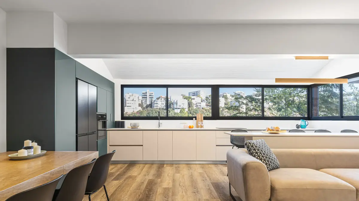
Panoramic window in the kitchen (Photo: Idan and Eitan Photography)
A master bedroom that was created on the upper level of the house and was one of the goals of the renovation (Photo: Idan and Eitan Photography)
The renovation focused on the 70-square-meter upper level (Photo: Idan and Eitan Photography)
The initial need of the customers was to create a unit for the parents.
The planning revolved around changing the existing locations in the apartment, including changing the location of the entrance to the house.
Since the main entrance was previously built as a kind of narrow corridor at the end of which are the guest toilets, it was decided to take advantage of the passage to the master shower, which became part of the new master unit, and move the entrance to the house to a new location.
A hallway and guest bathroom have become a bathroom adjacent to the master suite (Photo: Idan and Eitan Photography)
The main entrance to the Haifa house sat on a sloping slope, on which there was an existing podcast that was fully utilized, so it was necessary to produce a new entrance path to the house.
For the new entrance an opening was opened in the air without support for walking, which required a solution in the form of a bridge.
In the public space left after the allocation of space for the bedroom, two walls were removed, and the kitchen was given panoramic views of mountainous Haifa with lots of vegetation and lots of light.
To allow the image of the infinite landscape to exist within the space at all times, it was decided to choose transparent windows with a clean and minimal profile.
"We prayed that customers would not regret the color at the last minute."
Tall cabinets in the kitchen in a green color (Photo: Idan and Eitan Photo)
An island that separates the kitchen from the living room and serves as a dining counter (Photo: Idan and Eitan Photography)
The kitchen was designed for maximum utilization of space, and along the main window is added an island that forms a kind of backrest for the sofa and marks the boundary between the kitchen and living room.
Because customers love to entertain, one of their main requests was a dining table that could be opened to a maximum size in the space.
For this purpose, the public area was left vacant as a modular space in which the table could be deployed during hospitality.
The table chosen is rectangular with a light wood top and massive black metal legs.
Around it were placed 6 black dining chairs.
Maximum utilization of space and maintaining balance and harmony in colors and materials.
The kitchen and living room (Photo: Idan and Eitan Photography)
A table that could be opened for entertaining was one of the tenants' requests.
Dining area - Zaga (Photo: Idan and Eitan Photography)
According to the designers, the choice of materials and range of shades was challenging because it was necessary to match the colors in the public space to the dark green shade chosen for the tall cabinets in the kitchen and became a factor with a dominant design presence in the space.
But not everyone was sure about it from the beginning: "We were afraid that the customers would regret it, and change to a solid shade. And right up until the cabinets went down for production, we prayed that this green would indeed be implemented and not be replaced with a standard shade," say the designers.
"But the lovely customers flowed with us and they too fell in love with Gwen in the end."
The last bottoms in the kitchen and island, which serves as a dining counter for everyday meals, are painted in a light and warm shade, befitting the parquet that tiles the entire space.
The parents' room (Photo: Idan and Eitan Photo)
It was clear that the furniture and materials chosen must be light and live in good balance and harmony with the rest of the elements in the space.
"We must point out that the space was very challenging and tricky, and a lot of thought was put into making sure that the utilization would be maximum and that in the end the space would be inviting, bright and not crowded," the two say.
In the living room, a Rish sofa was placed in clean and slightly rounded lines, with black metal legs and a light beige upholstery. In front of it was an armchair upholstered in green velvet fabric that echoes the color of the kitchen cabinets, and has a matching footstool.
Lightweight design.
Living room wall (Photo: Idan and Eitan Photography)
More on Walla!
Rising green: The charming house in Haifa painted in shades of mint
3 rooms, 86 sqm, 450,000 NIS: The renovation that did not skip any wishes
Saving from the first moment: How to start saving in four simple steps
The wall in front of the sofa was left relatively clean - the TV screen hung on it and on its sides hung four thin and minimalist metal shelves (two on each side) on which were small and delicate decorative items.
An airy, hollow sideboard furniture, made of a black metal frame, was placed on the floor.
And the resulting look embodies the same lightness that the designers talked about and aimed at.
Credits and suppliers:
Contractor: Eliran Shaked
SPC Parquet - Topolski Sequence
Kitchen: Semgal Haifa
Lighting: LED Galleries Haifa and lighting warehouses
Bathrooms: Topolski Sequence
Dining area: Zaga
Living room sofa: Maor Ben Haim
Buffet and armchair: Florlis
Bar stools: Urban
Home and design
exterior design
Tags
Duplex
Haifa
renovation
Renovations