
Simon, a 14-year-old English teenager, is teased by young people in his neighborhood because of his overweight.
After a clairvoyant predicts the outcome of a horse race, he pockets the tidy sum of 16 million pounds sterling... Well, almost because, as a minor, he needs the assistance of an adult. to cash the check.
Back home, Simon discovers his mother in a coma and his father has disappeared.
No choice, he must find it!
Ambitious work at the crossroads of comics and computer graphics (bird's eye view without perspective, characters represented by colored circles...),
The Color of Things
was selected in the official competition of the Angoulême festival before winning the ACBD Critics' Grand Prize.
A consecration for this tragicomic thriller with a particularly chaotic course.
Read alsoLes Pizzlys, Hoka Hey!, Corto Maltese… Comic books to offer for Christmas
Its author, the Swiss Martin Panchaud, has agreed to return in detail to the genesis of this first graphic novel started ten years ago, published in German in 2020 by Edition Moderne then in French on September 9 by Éditions çà and there.
The 40-year-old designer tells
Le Figaro
his desire to experiment with new forms of narration, without denying the mechanics specific to comics.
LE FIGARO. - The publication of your book was an obstacle course.
Martin PANCHAUD. -
The genesis goes back ten years.
After writing and drawing the first 50 pages, I received a support award in Geneva in 2012*, where I lived.
From there, I went to see the different editors, from the most natural in Switzerland to the most exotic in France.
I was told that the line lacked humanity, that it was too experimental, too indie… I was advised to go see Edition Moderne in Zurich.
As my future wife is from Zurich, I took advantage of a stay there to meet the publisher David Basler, who immediately fell in love with my comic strip:
"I've never seen that in my forty-year career!"
I moved to Zurich and found a job at Atelier Strapazin, where there are also the premises of the magazine of the same name and my publisher.
I learned a lot, raised funds and, in February 2019, I finished the comic.
The time to sign the contracts, to translate the book into German, to make the corrections, it has been scheduled for March 12, 2020, a key date in the history of our humanity!
(laughs)
This is how your first comic was published in German (
Der Farbe die Dinge
).
It's the story of my life!
You should know that I'm a big dyslexic: the text is very complex for me, I make lots of spelling mistakes… and when I finally publish a book, it's in German.
I have a little devil on my shoulder playing tricks on me… The fact remains that the book had great success in Germany, a country much less educated in comics than France.
About 5000 copies were sold.
I should have taken the Swiss German accent!
Martin Panchaud
How was the French edition of
La Couleur de Choses
born ?
I was in Paris for an artistic residency, sent by the canton of Zurich.
But my secret mission was to find a French-speaking publisher.
With my book in German, I went to the Pompidou Center and asked the bookseller the question, who showed me
Mechanical Sun
from Editions here and there.
I did not know at all.
I came across an interview with editor Serge Ewenczyk and was completely in tune with everything he was doing.
I made contact and he seemed very interested, until he told me that he only published non-French-speaking authors.
I should have taken the Swiss German accent!
Finally, my album matched his catalog so much that he gave in, some time later:
"Come on, we're going to do it, you'll be the first French speaker in the catalog and, since you're Swiss, it will remain a foreign book!"
Did the comic book sell well in France?
This is the third reprint.
Last I heard, 12,000 books were placed on a print run of 20,000.
Representatives sold it well to booksellers, who liked it very much and support it very much.
At trade shows, I realize that there is a small barrier to entry: people open the comic strip and say to themselves "ooh there, I don't want to hit this furniture assembly plan" but on the fifth page, it's good, they dive into the story.
The legend identifies three types of birds.
Editions here and there
The graphics of
The Color of Things
are very simple.
Why this desire for minimalism?
My path is: catastrophic compulsory studies, artistic studies and comics, then looking for a job that can fill my fridge.
So I studied graphic design.
But as it was the crisis, I found myself at home without too many professional prospects.
I had a lot of free time.
With a friend, the author and filmmaker Michaël Terraz, we wanted to reinvent comic strips, so we invited visual artists and photographers to see what it could look like... These works have been brought together in a book,
Jardin,
as part of our association L'Octopode.
For my personal work, I wondered what it would be like if I used the rigor and minimalism of graphic design, which removes the maximum to keep the essentials, with the spirit of the narration and the codes of comics.
Very quickly, I found that this fairly simple system of colored circles had potential.
It has become my toy.
By showing the result to other readers, I was reassured: everyone could read it, whether it was my mother or my neighbor.
By hiding the faces and bodies, I let the reader fill in all those blanks and I like to think it creates more intimate stories.
Martin Panchaud
Representing the characters with colored circles is a rather radical choice. Given the content of the plot, weren't you afraid of curbing the reader's empathy, of stifling emotion?
No.
I even think it's a bit the opposite.
What films and literature use is this power of projection.
In
Jaws,
the shark is scary because you can't see it.
In my comics, by hiding faces and bodies, I let the reader fill in all those voids and I like to think that creates more intimate stories.
He can put himself, his desires, his fears... into the characters and the narration.
Little street boxing lesson.
Editions here and there
All the circles are also the same size, which means that the reader has no physical a priori on the characters who are characterized above all by their actions...
Absolutely.
At one point I had to show gestures and I was like “here, I'm going to use a silhouette and work with that”.
But I didn't want to represent a body.
The size, the proportions already tell something.
So I removed this body and I looked for other solutions to express a movement.
I use medical things like a rib cage for example.
It was about being fair, understandable, precise, but without showing.
I happened to give in to aesthetics, that is to say to do impressive things, complex figures a little "wow", but I always returned to the minimal, to the essential
Martin Panchaud
The dialogues are placed outside the boxes and linked to the characters by lines that sometimes intersect. This requires gymnastics that can be confusing. How did you work to engage the reader and stimulate them without discouraging them?
You have to get into the reader's path and remove all the small pebbles.
This sometimes leads to redo the placement of the characters, to reimagine the scene, precisely so that the features do not cross too much or that a junction point does not cast doubt.
This work of proofreading, moving boxes and texts, requires a lot of back and forth.
But since I'm in digital, I can rework endlessly, until the last second.
It happened to me to give in to aesthetics, that is to say to do impressive things, complex figures a little "wow", but I always returned to the minimal, to the essential, because that disturbed reading and that it didn't bring anything.
The reader's journey must take priority.
The seer's lair.
Editions here and there
For some boards, you become a graphic designer by handling maps, legends, symbols... Is this a purely playful approach or a way of transmitting information in a compact way?
So yes, there are these pages where I leave my circles and my squares to go on to something else… Playing with this human ability to project oneself into maps and pictograms is ultimately to charge a form with emotion, which takes on a new meaning.
Here again, it's a kind of revenge on my dyslexia, on the trouble I had to learn to read, to write, this fight with these symbols that I didn't master (I'm still not sure I master them today!), and reclaim them.
The images, I know how to read them, I know how to recognize the map of France or Switzerland.
This new territory suits me well, I want to explore it because there is still a lot to do in terms of reading images.
Your question also reminded me of James Cameron's “Aliens” where at one point a radar shows a dot, and that dot is an alien.
I said to myself "this is what I want"
Martin Panchaud
Your comic evokes video games in an aerial view. Why do you particularly like this camera angle?
Right now, I'm working with a studio to write a video game with this language.
The aerial view is a good way to represent space.
For example, when I build a house, I add lots of objects and I wonder how to make a coffee maker seen from above… There is nothing more abstract!
I like to show an abstract image and have its elements decoded, so that people can recognize a kitchen.
I rely heavily on the experience of the reader.
Anglo-Saxon films, photography, art in general shower us with images that I reuse… In James Cameron's
Alien
, for example, there is this radar which shows a point, and this point is an alien .
That's what I'm looking for: that we understand with just one point all the stakes behind it.
A tense family atmosphere.
Editions here and there
How did you imagine this story of impossible to cash lottery tickets?
For another story, I was looking for what was the largest sum of money one could have in bearer form.
There are bearer vouchers, diamonds… but I found out that, theoretically, a winning lottery ticket is “bearer”.
I thought it was quite funny to put it in the hands of someone who needed a signature to receive the money
(the hero Simon is a minor, editor's note)
.
We often imagine that money will save us.
“If I was rich, I wouldn't have a problem anymore.”
I also saw acquaintances play the lottery every week and I knew very well that it would not solve their problems.
My family was very happy but the ideal nuclear family, close-knit, I don't know.
Martin Panchaud
Why this figure of the absent father?
I belong to a generation, or maybe a social class, where all my friends have had an absent father.
My family was very happy, but I don't know the ideal, close-knit nuclear family.
A back and forth occurred: some absent fathers would like to recover the thing, become friends with their son again, and others were present but now want to get out, go see the other side of the mountain.
I found it interesting to stage this crossover, these two types of screwball fathers who didn't have the instructions.
I wrote this story when I was not yet a parent but, now I have two children, I don't know if I would write the same thing...
Martin Panchaud wanted to reproduce the racecourse of Ascot in a precise way.
Thank you Google Maps!
Editions here and there
Are you sensitive to authors who, like you, like to push the limits of comics, like
Chris Ware
,
Marc-Antoine Mathieu
or
Shintaro Kago
?
Anything that rethinks the act of reading, including outside the book – for example
Building Stories
by Chris Ware – I love it!
This forces us to approach stories in another way… Marc-Antoine Mathieu manages very well to play with the fourth wall by piercing it to challenge the reader.
This is also what I do by addressing the reader with the whale: “I am aware that you are reading my story”.
I really like the idea of surprise.
Go beyond what the reader expects, make him laugh when he expects something serious...
Today, I particularly work on the relationship to sound;
I feel like in a laboratory with test tubes
Martin Panchaud
What will be the concept of your next comic?
It will always be with dialogues and abstract visuals that push the reader to project themselves into the story.
I have not finished with this language.
Today, I particularly work on the relationship to sound;
I feel like in a laboratory with test tubes.
My idea is to be able to work on the sound expression of an image, to represent sounds by shapes.
Once the reader has learned a sound vocabulary, he can be shown an associated abstract image and it is up to him to reconstitute this sound.
I don't know if this will work yet...
These experiences recall the work on language and symbols in the novel
La Horde du contrevent
by Alain Damasio.
Have you read it?
Not yet but it's on my stack.
When I listen to Alain Damasio at a conference or watch his way of working, I quite recognize myself in his approach.
And also in the fact that he hasn't published a mass of books, that he is working on something lasting.
This idea of doing three or four books in my career suits me well.
* Prize for young comics from the Republic and canton of Geneva, as part of the Rodolphe-Töpffer Prizes.
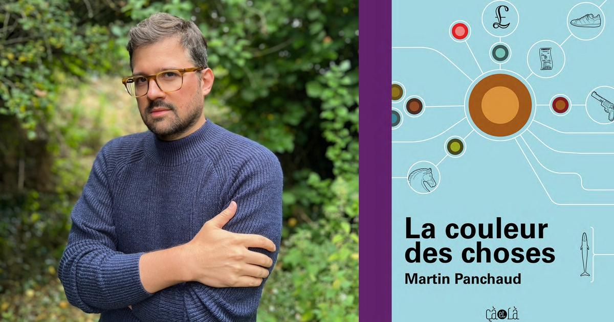
The cover of
The Color of Things.
Editions here and there
“
The Color of Things,
by Martin Panchaud, Editions here and there, 236 pages, 24 euros.