
A familiar fingerprint of a limited and clean set of materials and colors.
Duplex Penthouse in Sharon designed by Nitzan Horowitz (Photo: Oded Smeder)
"The owners of the house come from the field of entrepreneurship and construction and know how to appreciate quality and details" (Photo: Oded Smeder)
The project:
duplex penthouse in the city of Sharon
Tenants:
couple + 2 teenage girls
Area:
about 210 square meters + about 70 square meters balcony
Planning and design:
Nitzan Horowitz
Interior designer Nitzan Horowitz's specialty - what he is most identified with is designing spaces with A relatively limited array of materials and colors with which he creates dynamic and experiential living spaces.
This unique fingerprint is also clearly visible in the duplex apartment that he planned and designed for a couple of parents and their two teenage daughters, in one of the Sharon cities.
"The couple come from the world of entrepreneurship and construction, they live the field and know how to appreciate quality and details," says Horowitz.
"The fruitful conversation with them is a product of reciprocity; I fell in love with them at the very first meeting and after we defined the program, requests and dreams, they gave me a mandate and a free hand. The process was based on trust and mutual fertilization and the result accordingly."
A property with impressive architectural features.
Curtains sewn on site to match the high and sloping ceiling (Photo: Oded Smeder)
Gray porcelain, white carpentry and light wooden items.
Almost identical materials that produce a connecting thread in varying constellations and different dosages (Photo: Oded Smeder)
The two purchased the apartment from an elderly couple: "It is a property with impressive architectural features, but naturally the old design did not suit the needs of the young family, so we completely changed the internal division," explains the designer.
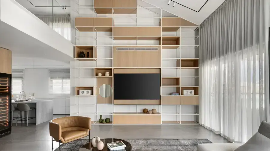
"One of the things we wanted to do was to enhance the dimensions of the double space. The uniqueness of this duplex lies in the fact that you can feel the two floors at a glance, and we wanted to enhance that. We harnessed the sloping ceiling, which reaches up to a height of 6.5 meters, as well as the other high elements, as an integral part separate from the concept. In practice, they constantly make the eye examine the space in a broad perspective - from bottom to top. Height, space and volumes play a significant role here."
The entrance floor designed by Horowitz consists of a public space with a living room, a spacious kitchen and a master wing for the parents in an area of approximately 60 square meters with a bedroom, a closet, a sitting area, a bathroom and a study. The line is modern, minimalistic and clean, and Horowitz was careful to incorporate everything The spaces of the house are almost identical materials that produce a connecting thread in varying constellations and different doses: gray porcelain, the white color that appears in the carpentry and frames, and of course the light oak veneer that adds interest, softness and warmth. "I created a game using repeating colors and similar materials out of a desire to maintain minimalism and a colorful tone ", he explains.
The original front door was replaced with an extremely tall door and the entire wall is covered with gray porcelain tiles up to the ceiling (photo: Oded Smeder)
Vertical monuments that amplify the height dimension.
The special library designed for the living room wall (Photo: Oded Smeder)
A view from another angle on the double space is possible from the family corner on the gallery floor (photo: Oded Smeder)
Horowitz harnessed the entrance wall to the apartment and the living room wall to create vertical monuments that amplify the height dimension in the double space.
He replaced the original standard entrance door with an extremely high door (about 2.8 m) that is integrated into the plane of the wall, which he covered with gray porcelain granite tiles (1.2/2.8 m) that continue all the way up to the height of the ceiling of the gallery floor.
The library in the living room is undoubtedly one of the most interesting features in the public space and emphasizes the movement in the space as well as the height of the sloped ceiling: "It creates a proportion between those staying in the space and the space itself and is another example of the use of specific materials, each time in a different application," explains the designer.
"In essence, the library is not used in this apartment for storage, but first and foremost as an element that emphasizes the height dimension. It is made of iron framework painted white, in which compartments and boxes of light natural oak veneer have been placed. We integrated the audio, air conditioning and television systems in it."
"All the materials in the living room move on the same colored scale. I was not looking to create a space full of colors but a harmonious and calm space. I incorporated an adjustable seating system that can be turned into a luxurious and incredibly comfortable sleeping surface. Underneath it was placed an original vintage wool rug and the curtains, which due to the challenging encounter with the sloping ceiling, will be sewn in the apartment itself. They add another layer of softness to the entire public space."
A large island with five seats is used for daily meals, hospitality takes place on the equipped balcony (Photo: Oded Smeder)
On the walls - Israeli art in organic colors (Photo: Oded Smeder)
In the kitchen, too, Horowitz made an element that enhances the height dimension in the form of a carpentry piece of furniture that is carried up to the ceiling of the floor and is a sort of corridor that separates the kitchen from the guest services area and the entrance to the parents' master.
This element forms a kind of anchor for the second floor and looks as if it rests on it.
The kitchen is divided into zones: in the long axis is a white-painted carpentry furniture that contains everything that is required in a modern and well-equipped kitchen.
In its continuation is the door that leads to the parents' unit.
In the center of the kitchen is a spacious island that is about 3.5 m long and about 1.2 m wide, with plenty of storage space and is used by family members for casual meals.
When they host, meals are served on the well-maintained terrace.
The family members often cook and entertain, so the kitchen is equipped with 3 integral refrigerators, a professional oven, a heating grate and other functions that allow entertaining comfortably and efficiently.
The balcony was designed in direct continuation of the spirit of the house and includes a lounge seating area, a dining area and a fully equipped outdoor kitchen: "Even on the balcony I chose to stick to the same clean color scheme, which is faithful to the concept from beginning to end. The dining table fits 12 diners, the outdoor kitchen is made of stainless steel and concrete and in the center of the sitting area The exterior has incorporated a fire table around which it is pleasant to gather and warm up on cool days and nights."
Sensual, dramatic and more intimate.
The bedroom in the master suite (Photo: Oded Smeder)
wraps the walls and produces doublings of the space.
Closet room (photo: Oded Smeder)
Dramatic and dark.
The bathroom in the master suite (Photo: Oded Smeder)
The art that decorates the apartment, which was created by Israeli artists, was precisely adapted to the different spaces of the house - from the public space, through the corridors to the rooms.
Horowitz made sure to stick to organic colors on pure shades of terracotta and cortan that combine with the shades of black and white and connect to the shades of the parquet floor.
The Master of Parents draws us into slightly different worlds and is designed according to Horowitz in a more sensual, dramatic and intimate way.
He combined elements in the color of the rust stain that are reflected in the art, the carpet and the sofa: "The mirrored front of the wall cabinet, which is opposite the bed, creates reflections, depth and looks in other directions," explains the designer.
The locker room is disassembled.
It wraps around the walls and the fact that part of it is transparent doubles the space, therefore the space looks bigger.
The split light oak parquet in the master master continues to the bathroom which is designed in an even more dramatic style.
The designer knew how to use a monochromatic color palette in different tones, such as carpentry covered with blackened veneer, powerful porcelain granite surfaces and a sink made of Caesar stone in a dark shade.
Precise definition of sleeping and learning area.
The bedroom of one of the girls (Photo: Oded Smeder)
Bathroom (Photo: Oded Smeder)
The girls' bedrooms were designed with the same materials as those appearing in the rest of the house, only with different assumptions and varying shapes (Photo: Oded Smeder)
The stairs leading to the room floor are covered with parquet without panels and the glass railing planted in the floor, without connections, creates openness and transparency between the levels.
There are three bedrooms on this floor: one of them was designed as a suite and another room is used as a guest room.
The highlight of the floor is the family area that overlooks the public space on the entrance floor and also benefits from the impressive library that emanates from the living room.
"The monochromatic coloring is also maintained in the girls' rooms and similarly to the entire apartment, where the carpentry was designed and manufactured CUSTOM MADE so that each of them enjoys a precise definition of a sleeping and learning area," Horowitz explains.
"The design language repeats itself here as well: the parquet floor conceptually connects to the closets, while the beds speak the language of the furniture we placed on the entry floor. The girls' bathrooms were also designed with the same materials as those throughout the house, but this time with different assumptions and changing forms. This creates a slightly different rhythm that is faithful for the atmosphere we wanted to create on the bedroom floor."
Home and design
exterior design
Tags
exterior design
renovation
renovations
Duplex
penthouse