Minimalism is here.
Planning and design: Nitzan Horowitz (photo: Oded Smeder)
Where:
One of the central cities
For:
A couple in their 40s with 3 teenage children
House area:
about 240 square meters built + 45 square meters balconies (land: 95 square meters, living: 95 square meters, attic: 50 square meters)
Lot area:
about a quarter of a dunam
Planning and interior design:
Nitzan Horowitz
In a quiet and pastoral neighborhood in one of the central cities, is located one of the special houses recently built in Israel.
This is the home of a couple in their 40s, who have 3 teenage children.
The couple purchased a lot on which a two-family house stands and they hired the services of the interior designer from an early stage, even before receiving the permit - he is the one who accompanied them and the licensing architect Ilan Dolev and is responsible for the interior design.
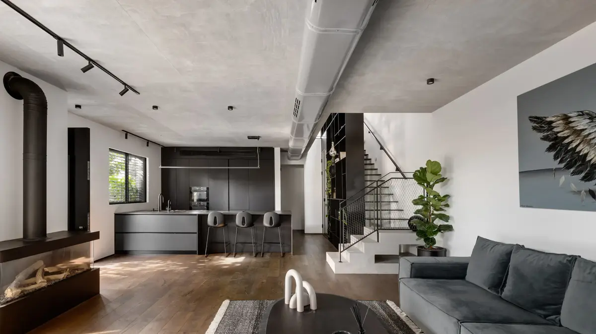
Between the modern and the industrial, between the rough and the clean (Photo: Oded Smeder)
"The process of working on this house was particularly fascinating for several reasons," explains Horowitz, "First, it is located on a small area, but we were able to create large, bright and spacious living spaces in it. Second, from DAY ONE, its owners knew how to delve into the choice of materials: they insisted To touch the material, to combine natural elements or those with a natural appearance, and this is how we managed to create a house that combines modern and clean elements together with industrial motifs - the design language moves on the seam between the modern and the industrial, between the rough and the clean."
The meeting between design styles is present in every corner (photo: Oded Smeder)
Indeed, the meeting between the two design styles is present in every corner of the house;
For example, the concrete plaster ceiling in the public space meets the kitchen covered with smooth matte black nano facades, and the aged oak parquet floor that blends wonderfully with the white walls - two different worlds of content that together produce a refined and harmonious cover.
A wall without openings and windows (photo: Oded Smeder)
Similar to most houses that are part of a two-family building, in this house too the bordering wall with the neighbor's house has no openings and windows.
Horowitz was able to design nearby the staircase and a monumental library that penetrates the floors and together they form the backbone of the house.
"This area is undoubtedly the FOCAL POINT and this gram is experienced from each floor in a slightly different way. I gave it considerable weight in the planning and the feeling one gets is that the house was built around it."
At the request of the home owners, a foyer was not planned at the entrance: "There is something very uncontrollable in the planning and there are no surprises. The first floor is already visible in front of you at the entrance, in particular the library and the staircase, and when you go up or down a floor you still experience the whole complex. On the entrance floor, the kitchen, which is located right at the entrance, the living room facing to the garden and the guest services. We gave up the formal dining area because this is a family that often entertains outside. They understood the limitations of the given space and chose comfort and airiness. In the kitchen, a very large 4.5 meter long island was designed, with seating for 6 diners - where they eat their meals The familiality. The facade of the high-rises holds all the elements and the feeling that is obtained is clean and minimalistic to the point."
A pleasant and inviting feeling.
The living room (Photo: Oded Smeder)
Next, the living room which is a strategic corner.
Together with the licensing architect, Horowitz designed curtain walls that open the space almost directly to the well-kept garden: "The feeling in it is very pleasant and inviting," he explains.
"Industrial style is often interpreted as cold and alienating, but thanks to the monotonous colors and the lack of jumps or excessive textures, the feeling you get here is very inclusive and enveloping. The exposed air conditioning duct, the impressive fireplace and the combination of concrete and reed wood give this area a precise and clean look. The lack of niches and divisions enhances the elements in it - the interior Feels less architectural and the division between functions becomes clearer."
The guest toilets on the first floor are covered with polished iron-like porcelain granite tiles.
Here too, Horowitz chose to combine rough and clean elements such as a sink made of a marble cube, an interesting set of faucets and a work of art created by a friend of the couple.
Penetrating the space (Photo: Oded Smeder)
In the monumental library, which is made of iron, penetrates the double space and transforms up to a height of 4.5 meters, the designer integrated the advanced systems as well as the communication and electrical cabinets.
The cantilever staircase is adjacent to it but is completely detached from it: "The steps are made of iron and have undergone a special painting process in the field. The railing is made of stainless steel mesh in a graphite gray shade; it is practical and standard yet it is open and airy and allows you to walk with and feel without," explains Horowitz.
"He and the library are two elements that can be seen from all the floors, and together they create a never-ending experience. While in most houses they are called on each floor separately, in this case it doesn't matter which room you leave, you will always experience them fully."
meeting point.
Master bedroom (Photo: Oded Smeder)
When you go up to the living floor, where the parents' master bedroom, a service area and the suites of two of the children are located, you will find the family corner and then a balcony: "We created a meeting point for them that unites everyone, a living room for everything," Horowitz explains.
"On this floor, the low-rises are only in the bathrooms and corridors, so we were able to leave the main spaces at a height of 3 meters. Similar to the other floors, this floor is also fully utilized; there are no areas that do not have a functional association. We were able to create for each and every one of them private and intimate landings and a corner The family is everyone's property."
The son and daughter share a common bathroom and each of them got a suite in monochromatic colors: "The son's room was decorated in 50 shades of black, and the daughter's in 50 shades of white," smiles the designer.
"While his room corresponds with the design concept of the public space and the rooms of the older son and the parents, she asked for a softer and airier look. This is reflected in the art, the carpet,
A floor that combines all the elements in the house (Photo: Oded Smeder)
The master bedroom, which is about 35 square meters and also includes a private balcony, was designed with the same colors and materials as the rest of the house. Horvitz designed for the couple a spacious bedroom, a bathroom and an open closet. "I stayed true to the materials and colors in order to continue the story of the house , from start to finish.
The closet is very reminiscent of the kitchen on the entry floor and the sofa bed in the living room.
Maintaining the same materiality and monotonous shades created a balanced and relaxing space.
The vegetation and art add another layer that contributes to the feeling we wanted to create."
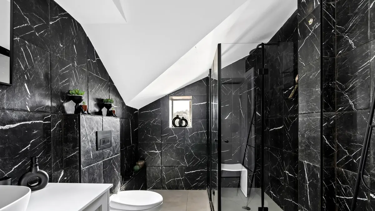
The walk-in closet is open to the sleeping area between it and the bathroom. A glass wall separates it from the bathroom, which allows light to pass through and on the other hand preserves privacy: "Here, too, I used shades of black, such as the bathroom cabinet covered in black veneer with iron legs, the wall coverings , the faucets and the shower profile are also black.
We used few materials and thus created a very clean look."
Spacious and cozy (Photo: Oded Smeder)
On the roof floor, which has an area of about 50 square meters, a living unit was planned for the eldest son, which includes a living area, a kitchenette, a suite and a balcony that is also used for entertaining: "This floor combines all the elements of the house and it all converges into a relatively small space: the stainless steel, the iron, the shades of gray And the camel touches that are experienced throughout the house, are all present in it as well: the kitchenette is very reminiscent of the main kitchen, the curtains are also in the color scale of the textiles on the other floors.
Here too, on the one hand, there are many layers, and on the other hand, there is no excessive play of textures."
Home and design
Pretty Things
Tags
Home


/cloudfront-eu-central-1.images.arcpublishing.com/prisa/KMEYMJKESBAZBE4MRBAM4TGHIQ.jpg)