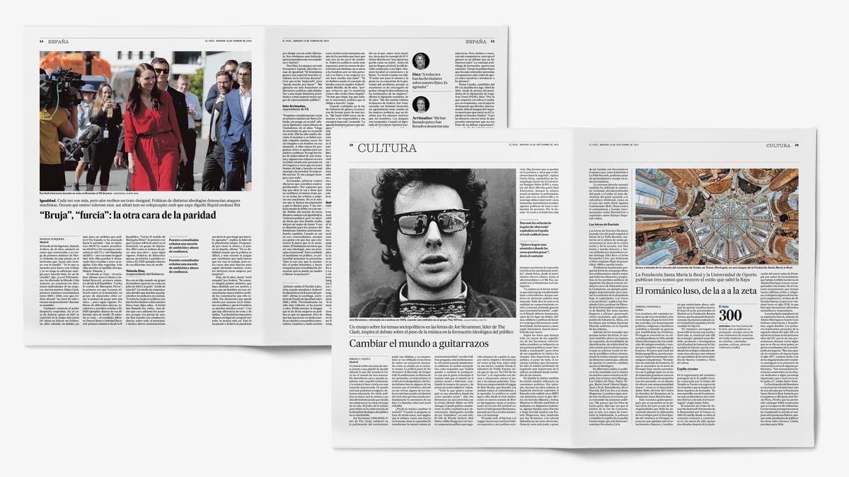
The newspaper you have in your hands today is totally new, redesigned from start to finish with the aim of being the same newspaper as always.
More elegant and clean, it debuts a typography designed to increase the readability of the texts and an order of sections with small variations: it groups global, political and economic information, on the one hand, and social, sports, cultural and lifestyle information. , for the other.
The project has involved a year of work and has involved the newspaper's design, editing and technology teams.
The newspaper's director, Pepa Bueno, assures that readers will immediately identify EL PAÍS: "The identifying features remain intact, but in a third decade of the 21st century version."
The print edition remains relevant in the digital age.
Its readers, in paper or through downloads through applications such as Kiosko and Más, will appreciate an orderly, selective and clear-hierarchical product, which offers essential information, analysis and opinion, and in-depth readings to understand our world and our time. .
The new format is somewhat shorter, 37 cm high, and has already been adopted by practically all Spanish newspapers.
The design change seeks to provide the pages with greater elegance and clarity, eliminating unnecessary graphic elements and better prioritizing the information formats.
The texts gain prominence, accompanied by small sections—phrases, figures or key data—that add different reading speeds to the pages.
The style of the printed edition is also harmonized with that of the digital edition, which renewed its design in 2021.
Majrit Text is the font used in the texts of the products published by EL PAÍS, while its condensed version is the main title letter of the newspaper.
For its part, Marcin Antique will appear in the titles of the Sports section and the photo captions.EL PAÍS
The readability of the texts has been key in the change.
With the use of the Majrit Text family, designed by Portuguese typographer Mario Feliciano, a long-term project that began in 2018 and which has progressively unified the fonts of its publications is completed.
Readers of EL PAÍS will notice that the texts of the newspaper,
El País Semanal, S Moda, Icon
or
Babelia,
in their print and web versions, have a family resemblance.
The entire project has been developed internally, in a great technological change invisible to readers but crucial for the work of professionals.
The newspaper is made from today in a new, more flexible and solid editorial system.
The weekly supplements also record design adjustments that maintain the identity of each publication.
Ideas
honors its spirit with a restful and serene setting.
Babelia
simplifies its cover to give more strength to the images.
Y
Negocios
changes its titling formula to make it more stylish, in addition to reordering its pages and sections.
For Diego Areso, art director of EL PAÍS, the main challenge in this redesign has been “drawing the architecture of the pages so that the smaller format hardly involves any loss of content.”
And do it while maintaining the personality of the newspaper.
“Although we have redesigned everything,” he adds, “the project will be a success only if regular readers feel that this new EL PAÍS continues to be their newspaper.”
Majrit, a legible and elegant handwriting
Present in the newspaper today, the Majrit Text font gives legibility and graphic coherence to all the products published by EL PAÍS.
It was already used in web texts, supplements and magazines.
It is an evolution of our previous typeface, Majerit, both created by the Portuguese designer Mario Feliciano.
For this project, he has precisely redrawn the font used in the headlines to modernize it and optimize space.
In the image, in red, the profile of the old typography.

