
The latest Nokia logo./screenshot, 1000logos.net
Why does humanity need logos?
A logo (in Hebrew, symbol) is a visual symbol that represents the company and serves as its face and is one of the components that will influence and convince us to choose this or that product.
In essence, a logo reflects ideas, values, feelings, emotions that the brand wants to convey to us consumers.
The logo is the symbol that conveys the whole experience of using the product on all levels and the sign that distinguishes the product from a similar product and hence its great importance in marketing.
The logo is an essential part of the customer experience that allows the consumer to 'get to know' the product even before using it thanks to its colors, shape and of course the accompanying slogan.
The evolution of the logo concept
In recent decades, several trends and changes in the concept of the logo can be observed.
In the past, logos played a crucial role in differentiating such items from others mainly because most people were illiterate and relied on pictures, drawings and symbols.
The logos allowed a simple marking and diagnosis of products as belonging to some brand and its values.
Due to their great importance in this context, in the past, it was common to think that logos should remain constant.
Today it is already clear that commercial logos need to be updated in parallel with the changes that our society is going through, in order to remain relevant to the new needs of society, literally.
How the Nokia logo has changed throughout history./Screen shot, 1000logos.net
Prominent trends in the design of brand logos
Less is More -
Many of the modern logos have gone simplicity and focus on minimalism.
The goal is to create a clean and easily recognizable image, as seen in the new logo designs for companies such as Apple, Google and Nike.
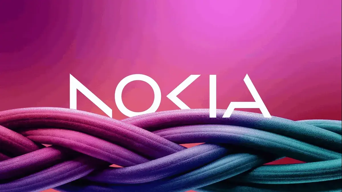
Particularly interesting is the example of NOKIA in 1856, the Finnish company 'Nokia' which switched from a logo that included the company's name and a ring from which came the figure of a salmon fish (as a tribute to the fish that swam in the Nokia River in the city), to a minimalist logo in 2023.
In fact the logo today does not even include the letters of the name "NOKIA" in full.
In 1856, the Finnish company 'Nokia' was then a paper manufacturing company, which was inspired by the salmon that swam in the Nokia River, which passed through the city of Nokia in Finland.
The logo at that time included a hoop through which the realistic image of a salmon fish with its mouth open came out.
Brand personality
- more and more companies realize that the logo should reflect not only the business but also the brand personality.
Therefore, companies make use of colors, fonts and graphic styles that express the brand identity and its values.
A particularly interesting example is the Amazon company logo including an arrow connecting the letter 'a' to 'z', which conveys the message that everything from A to Z can be found on Amazon.
Multi-channel along with interactivity and dynamism
- in the digital age, logos need to adapt to a wide variety of platforms, from large screens to small smartphones.
Therefore, modern logos are now designed to be readable and understandable at any size and on any platform.
In addition, many companies such as Google and Netflix use logos that change and adapt to different contexts, which gives them a sense of liveliness and dynamism.
Dynamic maintenance and adjustment
- modern logos are built so that it is easy to update and change them according to new developments and trends, so that the brand can continue to be relevant over time and will not require change and a high accompanying investment from time to time (signage, branding of points of sale, etc.).
When the sound of the company name affects the logo
In the 100 years that the TEKA electrical products brand has existed, the sign logo has gone through several incarnations.
At the beginning, the company was called TK and it was decided that the logo would include the first letters of the brand founders' last names, T and K. About thirty-one years later, it was decided to change the color of the logo to red, with white outlines.
In 1964, many consumers mistook the German brand name TK as TEKA and hence the word was added to the company name, and logo.
In the next three changes that the logo went through, it included the word TEKA in its design and completely removed the sign of the letters TK when they are connected.
As mentioned, the logo underwent a fundamental change, if only because of the syllogism the customers used to call it - an interesting example to illustrate dynamic maintenance and adjustment.
The evolution of the TEKA logo./PR
In conclusion
Logos greatly influence our buying and consumption decision by conveying ideas, values and feelings related to the brand, allowing us to 'know' the product even before using it.
In the past, it was common to think that it was wrong to make changes to logos and that they should remain the same.
In light of the AI revolution there are interesting questions that need to be asked
1. Will the ability to draw and design with creative artificial intelligence lead to a more frequent turnover of logos - given the simplification of the process?
2. Are we going to see smart algorithms, ones that learn us and give companies the ability to make personal adaptations in the logo design (a font that will attract us more, a different shade, etc.) similar to the Netflix algorithm that displays for users, a different theme image for the same series, after it learns us and who knows what will attract us to start watching it?
The author is Ami Asher, Vice President of Maximmedia Marketing Systems.
More on the same topic:
Logo
Nokia
Brand