Football is changing.
This is true of every aspect related to this wonderful sport.
From the rules, tactics, aesthetics, speed of the game, to the way we consume it and watch it.
Another thing that has changed at a dizzying pace in recent years is the way we see it and its hallmarks.
As befits the current era, visibility is no less important than content.
Shirts, merchandise, social media and actor shows - all grandiose and pompous and colorful (sometimes appalling).
Recently, even the most traditional symbol is changing shape - the club logo.
This little symbol that is on the shirt, the one that stores history, identity, belonging to the place - it is also undergoing modernization.
This usually happens in teams that have changed ownership and passed into the hands of businessmen who are also trying to leverage profits by changing the logo, and suffice it to mention Juventus, Manchester City, West Ham, Atletico Madrid and Inter.
There is a trend here, and in recent days more and more clubs around the world are joining it and changing the logo.
It always comes with a promotional video that tries to explain the move, but in many cases the move has met with criticism from more traditional fans.
Following the epidemic, we conducted a special project here in which we summarized the latest logo changes, for your judgment:
Norwich
(England)
Why they changed: As part of the celebrations of the 120th anniversary of the club's establishment, it was decided to refresh the emblem.
According to the club, it was decided to adapt it to the digital age and wrap the icons in the same design language.
The work on the new logo took two years, according to the official announcement, and everything was done in consultation with fans.
What changed: The important markers - the canary, the castle and the lion - remained part of the symbol.
What has changed is mainly their visibility.
In the new symbol all the elements are much clearer when the black outline disappears.
What the fans are saying: Overall get it well.
The change is not drastic, the end result is clean and beautiful, and there is not too much difference to the old symbol.
What do I think ?: very much like.
Norwich did consider tradition and symbols, but at the same time introduced modern and design touches.
10 out of 10.
Old versus new.
Norwich's Transformation, Photo: From Twitter
Cross Asul (Mexico)
Why they changed: The idea that led to the change was titled "The Stars in the Heart."
It stems from the fact that the new symbol does not show the stars that indicate the number of championships the team has won, now the championships and the memories, the past and the future - all of these in the heart.
In reality, the purpose of the change is to open a new page after parting ways with the Alvarez Cuevas family who ruled the club for over three decades and left it with much damage.
What changed: The stars that surrounded the emblem went down, and instead the inscription "Cross Asul Football Club" appears around the blue cross symbol.
What the fans are saying: Confused.
The new icon is beautiful, no doubt, but the lack of stars is not easy to digest.
What do I think ?: The symbol of Cross Asul is one of the most beautiful and familiar.
The change is very significant but at the same time minor, and there is an interesting thought behind it.
8 out of 10.
𝗢𝗙𝗙𝗜𝗖𝗜𝗔𝗟 𝗢𝗙𝗙𝗜𝗖𝗜𝗔𝗟: Cruz Azul Change Name & Logo: https://t.co/RhocSPHcBf
- Footy Headlines (@Footy_Headlines) June 21, 2022
Real Valladolid
(Spain)
Why they changed: In honor of the club's 94th anniversary, which came shortly after the rise of the league and when the club's owner is the Brazilian Ronaldo, it was decided to make a change in the symbol as well.
"We want to go back to the sources" read the official announcement, where they also added;
"Respect the essence and advance the future, return to the past to project it into the future."
In fact, the new emblem is trying to correspond with the original emblem of 1928, the year of construction.
What has changed?
Lots.
The swords disappeared, the leaves were erased, the crown was changed, the flags were edited, the caption changed, the colors changed.
Orna Datz could not have done more.
What do the fans think?
They hate it.
Fan organizations are angry that this was done without consulting them, what is more they think the new logo harms the identity of the club.
There have been attempts to set up a petition that prevented the move, but it will not happen.
What do I think?
The change is radical, very much so.
The new emblem lacks very many elements that were in the previous one, but when you look at the history of the Valladolid emblem, you can see that the new one is indeed trying to be true to the original.
It could have been done more gently, maybe even gradually, but the end result is not terrible at all.
6 out of 10.
🚨 OFFICIAL!
Real️ The Real Valladolid announces its logo change pic.twitter.com/OSIh53rgL0
- LigActu 🇪🇸 (@LigActu) June 20, 2022
Crystal Palace
(England)
Why they changed: According to the official website announcement - to place the club on the history axis where it deserves to be.
The first and only goal is to mark the year in which the cricketers established the club, and not the year in which a professional club was established.
What has changed?
The year that appears on the symbol.
The place was founded in 1905, now appears on the emblem founded in 1861.
What do the fans say?
Proud.
Their club is currently the oldest to play in the professional leagues in England.
What do I think?
Who changed the date.
So Crystal Palace are claiming that they are the oldest professional football club out there.
Which of course affects their crest.
From 1905 to 1861. # logodesign #LogoDesigns #badge #logo #newlogo #crest #PremierLeague #crystalpalace https://t.co/D2QtIxwEBV pic.twitter.com/rk9IXtxxJP
- World Football Club Crests (@WorldClubCrests) June 18, 2022
Girona
(Spain)
Why did they change?
The club wanted something simple, smart and modern that represented a club over 90 years old, and in honor of the league’s rise it was decided to expose it.
Interesting is the design process, which was an open competition in which all the fans were allowed to participate and present their idea.
Equally impressive is the fact that the fans were also the ones who chose which two would reach the final and that one of them would be chosen by the club members.
What has changed?
The crown that was above the emblem disappeared.
The caption, which was originally small and at the bottom of the emblem, was enlarged and spread over the whole.
The colors are sharper, the black is gone and there is more spice between the colors.
As befits a team owned by City Group, the new logo is reminiscent of that of Manchester City and its sisters.
What do the fans say?
They chose, they designed, they kicked.
What do I think?
Beautiful initiative, impressive execution, 9 out of 10.
The old and new emblem of Girona.
Requested change, Photo: From Twitter
Valencia
(Spain)
Why did they change?
To pay homage to the Mestalla Stadium celebrating 100. Also, the change will be for one year only and only for the home shirt.
What has changed?
The shape of the bat, the caption, the ball and the colors of the symbol.
What do the fans say?
Very complimenting, but knowing that this icon is temporary and for only one season.
What do I think?
There are things that do not touch them, even temporarily, and the emblem of Valencia is one of them.
2 out of 10.
ValenThe Valencia logo will change for this season only to celebrate Mestalla's centenary!
🗞 @ marca pic.twitter.com/aOKW60PaF1
- LigActu 🇪🇸 (@LigActu) June 20, 2022
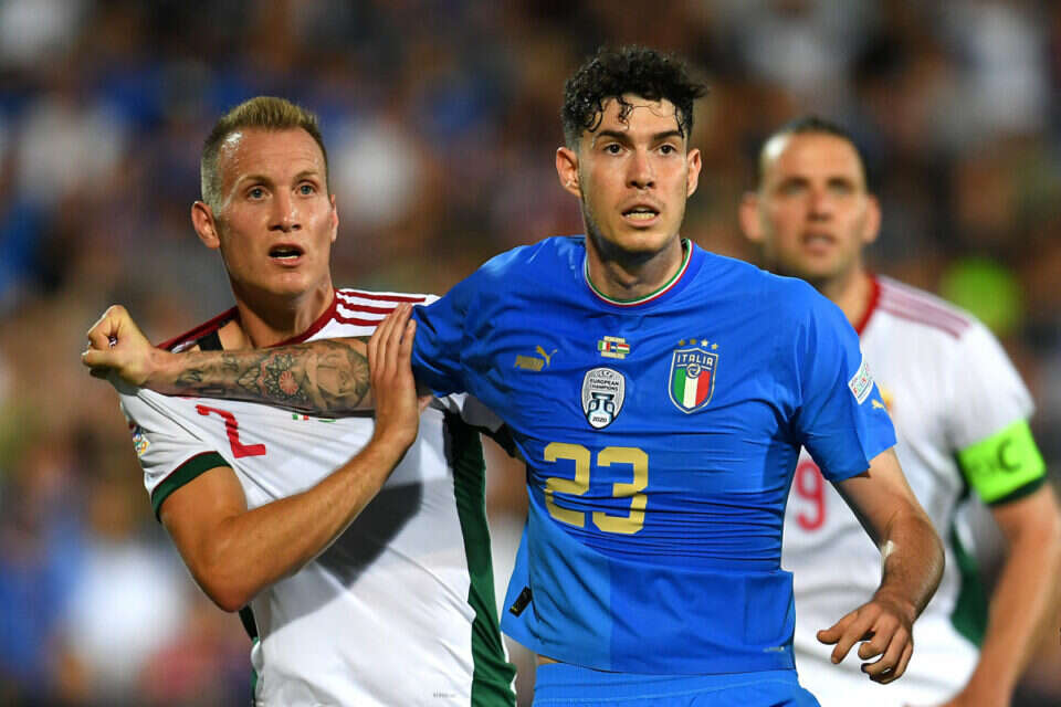
Italy national team
Why did they change?
The Italians change the logo frequently, and this time it is related to the termination of a contract with one clothing company or another.
What has changed?
Small touches in everything.
The colors of the stars were changed, the shape of the frame changed, the caption of Italy and even the shape of the flag - everything got a new touch.
What do the fans say?
Do not particularly like.
Style is a sensitive issue for Italians, and the current icon is not exactly dripping with style.
In modern history there have been more beautiful symbols, according to the fans, who do not understand why it is necessary to repair something that is not broken.
What do I think?
Were more beautiful, but the Italians are always beautiful enough.
6 out of 10.
🚨 Italy will have a new logo from 2023!
Thoughts.?
📸
📸 @Footy_Headlines pic.twitter.com/AcXV1uZJeB
- Sports update.
(@ Shafaqut94) June 22, 2022 Wrong?
Fixed!
If you found an error in the article, we'll be happy for you to share it with us


