Every time you write an email in the Outlook program or open a Microsoft Office document (be it Word, Excel, PowerPoint, among others), as millions of people do every day, the program uses by default (or by
default
, it is i.e. automatically if no other is chosen) a font called Calibri.
This has been the case since 2007, the year in which it replaced the legendary and stale Times News Roman.
But the Calibri has little reign left.
The US company will decide the new default option among five candidates.
"Dear Calibri", says the company itself in its ad.
"We have loved the time we have spent together, but we have moved on from this relationship."
More information
Rise and Fall of the Times New Roman Empire
What is your type?
This is how the inventors of Times New Roman create new fonts
To do this, Microsoft has commissioned five proposals from nine designers.
Their names, Tenorite, Bierstadt, Skeena, Seaford and Grandview.
Only one of them will be chosen to appear by default in each new document, but the remaining four will become available among the more than 260 options that are integrated in Microsoft Word and in the rest of Office programs.
All five, by the way, are already available as a trial in Microsoft 365.
Sample of the default fonts that Microsoft is studying to implement.
Microsoft assures that "it is time to evolve." José María Ribagorda, designer (his letter Ibarra Real is in Google Fonts) and coordinator of Graphic Design at the Madrid School of Graphic Design, agrees and affirms that Word is a product "that has become outdated" compared to competitors like Google Docs and that changing the letter "gives a feeling of youth."
And why is this change so important to us as users?
"Because the next type will redefine the concept of typographic familiarity for millions of people," says Pedro Arilla, font designer.
His clients include MotoGP or Zacapa rum, as well as having participated in projects for Google or Amazon.
“I do not know the exact percentage of documents that should be generated in the world with Office, but I bet it is very high.
And among them: how many go with the default font?
I would say that, again, a very high percentage ”.
Its competitors opt for more classic options: Apple uses the Helvertica Neue in Pages;
and Google, the Arial in Google Docs.
The era of the Times
Times New Roman is a typeface with more than 80 years of history. This was the first font Microsoft used in its Office suite, in the days when it ruled our computers with an iron fist. And that "it did not work well for the screen," explains designer Andreu Balius, who has worked for SEAT or for Ferrovial, among other clients. "In the beginning, the ultimate goal of Word documents was to be printed later, and there the Times did read well." Diego Areso, art director of EL PAÍS, explained to Verne that "since it was a typeface that was on all computers, it was also the one that was used most frequently in the first web pages."
EL PAÍS, by the way, used Times New Roman until 2007. That year it replaced it with Majerit in its printed and digital versions. According to Areso, it is a typeface similar to Times New Roman, but it also has more personality. In 2015 the Benton was added for texts on the web (for example, this text you are reading right now).
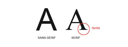
Bailus argues that the main problem with this font was what are called
serifs, serifs, serifs
, skates
or
terminals
: those little ornaments that some fonts carry at their ends.
“The problem with serif is that with low resolution screens, before the advent of modern screens, the drawing of the letter did not fit with the pixel and the shapes of the letters were not defined on the screen.
You had to apply it to very large bodies ”.
Letters without serifs are called
capella
or
sans serif
.
The five proposals handled by Microsoft fall into this category.
Those that have it are usually called
Roman
.
Serif and sans serif lettersFundéu
The arrival of Calibri
Microsoft solved this problem in 2007, when it introduced a new typeface designed expressly by Lucas de Groot. "The Calibri is a very good typeface," says Andreu Balius. "It is designed for the screen, using the technology and screen resolutions of the moment." According to Pedro Arillo, “Calibri was a huge evolution from Times New Roman in terms of visual friendliness. It is a modern and smoothed sans-serif, more in keeping with the digital medium and with the break that was wanted to be made with respect to physical language ”.
Why did the Calibri work? Something similar happens to referees in sports competitions with default typefaces: they do their job when they go unnoticed. "We rarely give importance to them, and therein lies their greatest gift," says Microsoft itself. What technical qualities must a typeface have? The designer Laura Meseguer, author of types for Google and works for the press and municipalities such as Barcelona, believes that her characters must be "sufficiently differentiated", that there must be an optimal "generous" spacing for the eye to accommodate well. to reading and suitable for many contexts, publishers and titles. "Functional when in text size and elegant and distinctive when used in titles."
Some better samples.
No serif was commissioned, and that the majority of initial responses prefer the grotesque (Bierstadt) and geometric (Tenorite), but that's no surprise.
In single letters and short words folks naturally prefer the familiar and rational type of modern OSes.
https://t.co/mCPNCNGg0L
- Typographica (@typographica) April 28, 2021
How are the new proposals?
"The new proposals are very good from a design point of view," says Pedro Arilla. "There is, however, not as much variety as would be desirable." At present there is a clear tendency to dry stick, explains Balius. "And all the proposals go along that line." For Balius, the Tenorite follows “a bit” the Calibri guidelines, with a “more humanistic dry stick, of open
counterforms
[the inner target of the sign]”. In his opinion, the Skeena, resembles the Roman ones and presents "more differences between thick lines and fine lines". In the Grandview, the designer sees similarities to the DIN, the one used on road signs in Germany. "This typeface has a lot of personality", he assures, "and, therefore, it would not be good as a default letter: it would not give the right tone".
"Skeena and Seaford seem the most original to me," says Laura Meseguer. Pedro Arilla agrees in his opinion, who sees them as "somewhat more risky in terms of the change they would entail, although I am not clear to what extent the average user will be able to distinguish the nuances."
Ribagorda's favorite is Seaford, who, in his opinion, has a more complete family and a “more royal cursive”.
For this designer, however, the changes have to go further.
"In reality, Microsoft has to change all of Word, which has major usability and design flaws, and this is not solved with a change of default font: both the interface and the style sheets (a sheet of style is a predefined combination of a font type, a color and a font size that can be applied to any text in a document) ”.
And sentence: "The Word is one of the most horrible programs that exist."
You can follow EL PAÍS TECNOLOGÍA on
and
.