The architect Camille Hermand at the head of his eponymous agency likes challenges.
Capable of transforming a series of garages into a loft, of turning a 33 m² apartment into a perfect “pocket” Parisian apartment… She knows how to create additional square metres, bring in light, restore volume.
Once again, she proves her talent with this complex project which initially did not tempt her: to give charm and make functional a poorly built and poorly maintained 1960s house.
The starting point
“I visited this 1960s house located in Meudon in the Hauts-de-Seine, with my clients, in the sad light of the end of December.
It had been rented for twenty years and had not been very well maintained.
There were also a lot of details that had been tinkered with from the start… In short!
I didn't fall in love, but my clients were motivated.
And I agreed to embark on this big adventure which required, in order to gain square meters and make the space pleasant, a big construction site.
The bad surprises at the structural level did not simplify things!
But I don't regret having taken up this challenge because the result is fluid.
We breathe.
And the house is perfect for family life.”
The ground floor
Full screen
Before: a truly buried garden level Camille Hermand
Full screen
After: a TV room opening onto a terrace and the garden.
Agatha Tissier
Full screen
Before: partitions everywhere Camille Hermand
Full screen
After: a bright bedroom separated from the TV lounge by a glass door.
Agatha Tissier
Full screen
After: a bathroom dressed in zelliges Agathe Tissier
“The ground floor is the parents' area with a bedroom, a bathroom, a laundry room and a TV lounge.
Initially it was a dark basement with an area that had been converted into a bedroom.
To be able to occupy it, gain square meters, recover ceiling height, it was necessary to dig the ground under the original terrace with underpinnings to consolidate everything.
We then put everything in place to capture the light and make it circulate.
We have thus created a glass door which separates the TV lounge from the parents' bedroom and gives the impression that the bedroom and the TV lounge form one room.
The floor is everywhere painted white and there is a maximum of storage space in the bedroom to hide anything that could generate
clutter and possibly a stuffy phenomenon.
The bathroom is in the same spirit, very sober.
It is reached by going down a few steps.
It is dressed in white zelliges with, for a graphic side, touches of black.
The shower is very large and comfortable.”
The entrance on the ground floor
Full screen
Before: a sad and cramped entrance.
Camille Hermand
Full screen
After: a warm and enlarged entrance.
Agatha Tissier
Full screen
Before: a kitchen which accommodates the staircase.
Camille Hermand
Full screen
After: a refurbished staircase and a kitchen that has become an office.
Agatha Tissier
“We enlarged this space located on the ground floor, integrating the awning that existed in front of the house.
There is a blue plinth that connects with the rest of the house.
From this entrance, we access the toilets that we have created in a part of the old kitchen from which the staircase leading to the first floor started.
In the other part of this kitchen, the one with the stairs, we have fitted out an office.”
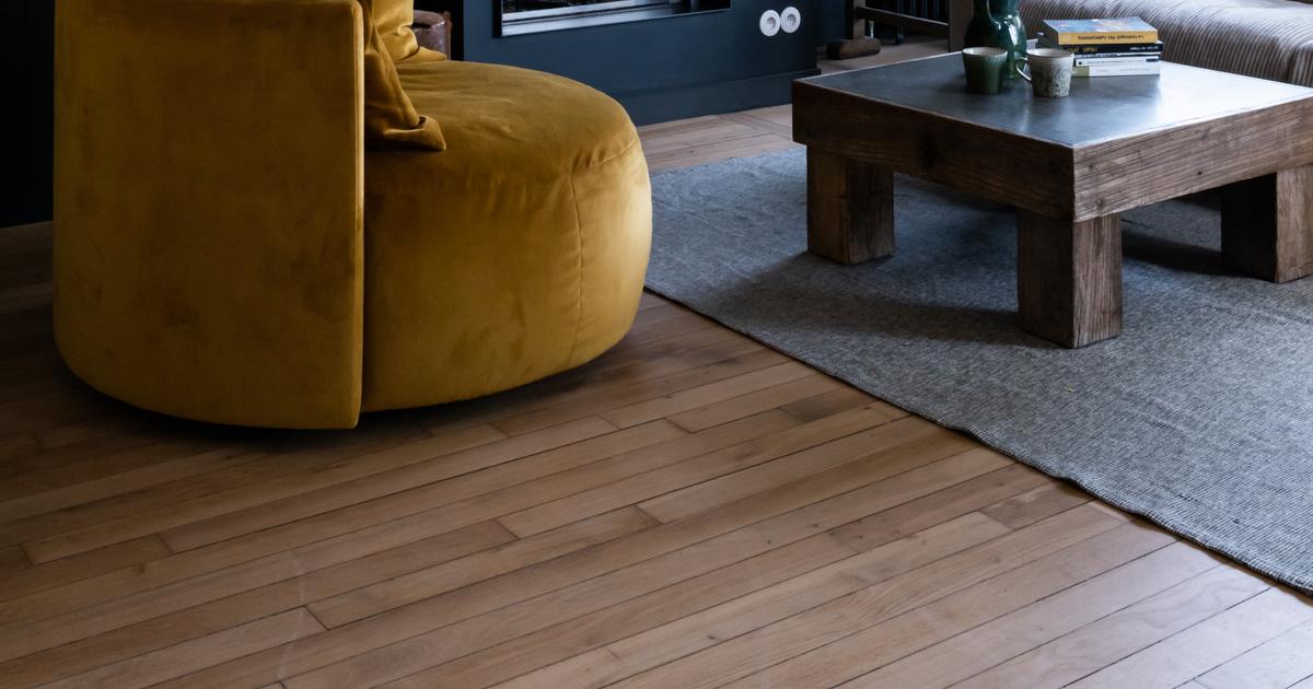
The “living room-dining room-kitchen” on the ground floor
Full screen
Before: a living space with potential.
Camille Hermand
Full screen
After: a kitchen and a dining room where life is good.
Agatha Tissier
Full screen
Before: a veranda off the ground Camille Hermand
Full screen
After: a veranda transformed into a living room with a bay window that evokes a panoramic screen.
Agatha Tissier
“The kitchen was in another room: the one where the office is now.
We have chosen to move it into the living space on the window side.
This space was as if separated into two zones by a wall with an opening that we widened in order, once again, to give a feeling of space.
In the extension of the kitchen is the dining area.
The living room is installed in the veranda part, the ceiling of which is deliberately not glazed.
I'm not a fan of high verandas, which was one of the particularities of the house.
To avoid the side "off the ground" which I dislike, I therefore chose to put a solid ceiling and to work with dark colors which allow the bay window to be transformed into a sort of panoramic screen which draws the eye towards the garden vegetation.
The first child's room
Full screen
Before: a cramped space Camille Hermand
Full screen
After: square meters gained thanks to work on the frame.
Agatha Tissier
“It is located on the first floor which is that of the children.
This floor existed but we opened the volumes under the ceilings, there too, to gain space.
However, we were constrained by the structure, which did not allow us to do exactly what we wanted.
We were still able to create two children's bedrooms to the left of the hallway up the stairs.
The one intended for the little girl precisely illustrates this work on the frame.
The bed is thus located in an area which was initially not accessible.
This gain in square meters allows real breathing.
In terms of decoration, we have made the choice with the customers not to “gender” this room: the idea is that it will always be suitable when their little girl grows up.”
The second child's bedroom
Full screen
Before: a feeling of suffocation.
Camille Hermand
Full screen
After: a real cocoon.
Agatha Tissier
“For this room, the idea was the same as for the previous one: not to type it “little boy”.
This goes through the furniture that customers have hunted.
It fits perfectly with the style of the place.
I think we have to stop systematically buying new!
The yellow guest room
Full screen
Before: an abandoned bathroom Camille Hermand
Full screen
After: a very small room full of charm.
Agatha Tissier
“It is located to the right of the hallway on the first floor.
This room is low-ceilinged and small.
But it made sense to make it an “extra” bedroom by adding a 140 cm bed. The Velux window provides light which makes it pleasant.
To optimize the space, there is no carpentry, no furniture: just wall lights.
»
The upstairs bathroom
Full screen
Before: yet another small room.
Camille Hermand
Full screen
After: a bright bathroom.
Agatha Tissier
“In this bathroom, the atmosphere is retro, simple with white tiles, new but “old-fashioned” basins.
We had a small budget for this room but it does not show!
What changes everything?
The green border that highlights the tiles and the beautiful taps.
We have also created masonry niches.
The set is really charming and it is particularly linked to the fact that there is no storage furniture.
I'm not a fan of bathroom storage and it's often a sticking point with customers.
But, for this project, that was not the case.
Customers, like me, felt that you don't have to store a collection of towels in your bathroom."
Contact Camille Hermand Architectures: camillearchitectures.com