William Randolph Hearst said that to sell magazines he only needed to put “a pretty girl, a dog or a baby” on the cover. That simple editorial recipe expired years ago (thankfully) but the mystery of what works when creating the first page of a magazine or supplement remains. Enigmatic photos? Artworks? A good close-up? Conceptual illustration? Handwritten lettering? You could say that at Babelia , 1,500 covers after our first issue, we have tried almost everything.
MORE INFORMATION
PHOTO GALLERYThe best Babelia covers, from 1991 to 2020
Babelia was born in 1991: the Internet was only a distant echo and newspapers proudly sold ink and paper. Since then, the design of the supplement has been adapted to the new graphic tastes of each era. Also to the technical novelties: the first covers were printed only in black and white; in 1995 a second color ink was added, which changed every week, and only since 2001 has the supplement come out with the current four-color.
Back to the beginning: what works when creating that first page that summarizes Babelia every week? “A good cover needs intelligence. Be understandable. That it leads you to read, that it encourages reading ”, explains David García, who was the art director of EL PAÍS from 1996 to 2007 and is responsible for a good part of the covers published by this supplement.
It is too optimistic to assume that all have achieved that dose of understandable intelligence, but 1,500 covers are a round number that lends itself to celebration and mildly self-indulgent texts like this. Also to statistics. In what way has Babelia tried to present its readers with “a good cover”? Let's go to the numbers. The supplement has had five designs, each representing a totally different graphic style. “In 1995 we wanted to take away the office worker tone with a less predictable design; in 2001, take advantage of color and present a large, more informative index of contents on the cover ”, explains García. The 2007 design, created by Óscar Mariné and Andreu Balius, imposed huge images on the cover with hardly any letters, which sought to contrast with the masses of text in the newspaper. The current design, halfway between both, seeks a balance between text and image, and recovers the most “refined” typographic compositions.
More figures: of all those published, 948 covers have had a photo as the main graphic element; 531 have carried a drawing, only 20 have been essentially typographic proposals. The simplest? One dedicated to Japan, and which featured a huge red circle that occupied the entire stain of paper.
When the writing is about to plan the cover it takes into account a multitude of factors; every week is a world. To begin with, what has been published in previous issues is valued (it is good to alternate styles and designs), and what the other supplements of the newspaper are expected to publish.
The graphic language of the supplement sets limits that must be recognizable by editors, designers and, more importantly, the readers themselves: the page architecture, the typography, how far you can play with the header, what type of lighting is sought for the photography or what kind of color for illustrations. If the cover is “character”, it will be necessary to decide if there is the possibility of photographing it or if it is better to use a drawn portrait. There are writers that we have seen so many photos of over the years that it is difficult to find a surprising photo. If the cover is “concept”, you have to decide the tone: which illustrator adapts to the theme and can bring a new point of view?
Sometimes the best illustration is a photograph or an already created work of art. To get them, you have to review the material stored in photo agencies or ask for authorizations from museums or galleries; bureaucracy, sometimes, is also design.
Diego Areso is the art director of EL PAÍS.
Emotion and responsibility
Fernando Vicente
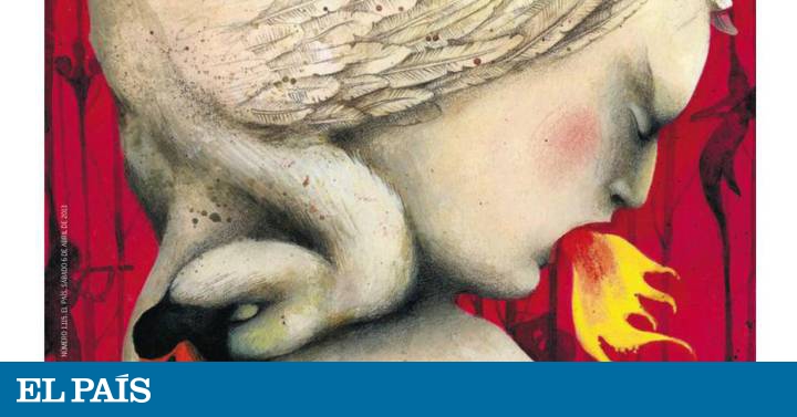
The day I start to write these lines, it is exactly 21 years since my first Babelia cover . She already worked for the newspaper, more with the Weekly, but finally she entered the section of the newspaper that she kept in a folder years before starting to collaborate. I kept those mythical covers of Loredano, whom I admire so much.
In these 21 years I have been fortunate to do more than 80 covers, the last one last week. I have very good memories of my collaboration with Babelia and I cross my fingers to get to 100. There have been several changes of model and we have gone from black and white to color. I have been able to make caricatures of writers, great literary themes, crime novels, humor, classic and modern dramons and, above all, books, many books.
When receiving the commission of a cover there is always an emotion and a responsibility, try not to repeat yourself when they are topics that you have already addressed. There are always themes that come back, crime novels, summer books, autumn news, books of the year and the Book Fair. I have been able to make several covers of this cultural event and even this year the cover of the fair that was not.
I have made covers with geographical maps, a graphic element that I especially like and that arose almost by chance, I made a small drawing about Brazil for the inside of the supplement and they had the happy idea of taking it to the cover, from here a series of more than 10 emerged literary maps.
For me it has been a unique opportunity to grow as an illustrator addressing the subject that I like the most, literature, culture. With these 1,500 numbers I have looked back and can only be grateful. So congratulations to the editor and above all… thank you.
Fernando Vicente is an illustrator and holds the record for covers designed for Babelia , with more than 80 in the last 21 years.


/cloudfront-eu-central-1.images.arcpublishing.com/prisa/TY47FSPP2RB4BEVHHZRVRO4QLY.jpg)