
Covid-19 contagion map. Unsplash / Google
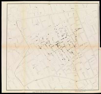
Had it not been for a map, the 700 people who died of cholera in one week in the London neighborhood of Soho would have grown into thousands in the following days. In 1854, the British doctor John Snow decided to map the water wells on a district map, which made it possible to locate the cause of the disease in the faecal contamination that was occurring in the Broad Street well. Snow recommended that the authorities close that water pump, and immediately the cholera cases began to decrease. A few decades earlier, in New York in 1798, Dr. Valentine Seaman managed to stop another epidemic, in this case yellow fever, by applying these data collection and visualization techniques through a map.
These episodes are considered the earliest examples of epidemiological mapping, the same tool that has made it possible to fight the covid 19 pandemic more than two centuries later and more precisely thanks to technology. Having georeferenced data allows establishing causes and relationships between different events and, most importantly, predicting how they will evolve and being able to act accordingly. The digital cartography generated in these two years of global health crisis has allowed international organizations and governments to make crucial decisions, not only in the health field, but also in the economic and social ones.
Before that virus originating in the Chinese city of Wuhan was known, the world map that the Global Preparedness Monitoring Board (JVMP) published in 2019 already warned of the growth of outbreaks of infectious diseases throughout the world.
At the end of that year, in Canada, the emerging company (
startup
) Bluedot crossed travel data from Wuhan with health diagnoses of respiratory infections that triggered many alarms.
"They were the first signs of what was to come," recalls Pedro Torres, marketing director of the Spanish branch of the Environmental Systems Research Institute (ESRI), the world's benchmark digital mapping software.
Map drawn up by the doctor John Snow in 1854 of the London neighborhood of Soho and which made it possible to stop the cholera epidemic
At the end of January 2020, the WHO confirmed the increasing cases of pneumonia of unknown etiology in the city of Wuhan and its possible spread to the rest of the country and the world. Media such as EL PAÍS began to produce the first interactive web maps with data on the disease, as reported by Carlos Guallart Moreno, professor of geography and collaborator at the University of Zaragoza, in the article The digital cartography generated by Covid-19: analysis and typography, published by the magazine Espacio, Tiempo y Forma of UNED. "The growing number of diagnosed cases and their appearance in different places makes it necessary to resort to cartography to better inform about the importance of the disease," says Guallart.
Since then, the epidemiological mapping of Sars-Cov-2 began to grow at the global, continental, national and even regional and local levels, which allowed the authorities not only to protect citizens against the virus, but also to plan what the return to normality and recover an economy paralyzed for two months.
Such was its significance that the Ministry of Transport, Mobility and Urban Agenda has recently published a National Atlas that analyzes the first wave of the disease from a geographical perspective.
How digital mapping helps decision making
"There were many efforts to understand what was happening throughout the country and to be able to take the most pertinent measures." This is how Gemma Boix Xamaní, head of the Geographic Information Systems and Remote Sensing Service (SIGTE) at the University of Girona, remembers it. The Boix team decided to put its knowledge of this technology at the service of citizens and the administration, creating a series of digital cartographies at the local, regional and national levels that are open to the public. Among this data collection and analysis are studies that determined the width of sidewalks in the city of Girona. "It was a very important aspect in times of de-escalation of confinement in which social distance was required to avoid contagion," explains Boix. "A) Yes,it was possible to determine which less frequented places were more convenient to travel to”, he adds.
At SITGE they have been offering an online master's degree on Geographic Information Systems (GIS) for 23 years. As its manager explains, the potential of this technology – through which data is collected, analyzed and represented by maps – is infinite thanks to the crossing of different variables. "It can be applied to any field, but of course in the pandemic, it generated many types of very useful information for citizens," Boix points out. “There are many examples, such as the application
How much is a kilometer?
, which allowed knowing how far one could walk from home during the first phase of the de-escalation; or maps informing about different establishments and which ones were beginning to open again after confinement, ”he adds.
"Until then, we had not needed to know the territorial limits of neighborhoods or municipalities," says Boix, "and all this geographic information allowed us to know what could or could not be done and where, it made our lives easier during those months" .
In addition to measures to prevent contagion, geographic information also contributed to economic recovery. “The data on the mobility of people allow us to determine crowded places and inform the population about it. This helped the reopening of tourism”, explains the director of ESRI Spain. And he continues: “Apps were developed that reported the capacity of beaches and other places of interest, others indicated the redesign of cities for safer movement; and there were even those that connected workers wherever there was work available, such as the app of the Agrarian Association of Young Farmers”.
Illustration of Thames Water (the London water company) also from the 19th century and that exemplifies the number of diseases that can occur through water contamination such as cholera itself or typhoid fever.
A technology accessible to all
It was not the first time that ESRI had faced a health crisis.
The research institute and its mapping technology played a fundamental role in the 2014 Ebola epidemic in Africa, thanks to the mapping of cases and the information associated with different variables.
This experience allowed them to lead the management of the Covid-19 pandemic through GIS technology and offer their collaboration to different entities, both international and national and regional. In Spain, his work with the autonomous communities was fundamental. “We got down to work teaching the administration workers how to use our mapping tool, ArcGIS, and they managed to create an impressive geographic information system in a very short time,” says Torres. "Just as we value the work of the toilets, we should do the same with the officials who have been working with this information that has later served to make many decisions," he adds.
The director of ESRI Spain highlights the use of GIS for the management of the pandemic that has been made by organizations such as the Military Emergency Unit (UME) -which precisely received the ESRI 2020 Special Recognition Award-, autonomous communities such as Castilla La Mancha, city councils such as the one in Valencia, or other institutions such as the Canal de Isabel II, which created the Vigía System with which they detect the presence of the virus among the Madrid population from wastewater.
Small administrations and organizations that have used the same technological tool as much larger ones. This is the case of John Hopkins University, whose Covid-19 map has become the most visited application in history, with billions of daily queries, according to ESRI data. "This has been possible thanks to the democratization of technology," says Torres.
This same cartographic tool developed by ESRI is the one used by Carlos Guallart when he taught Geography at the Santa María del Pilar Marianistas school in Zaragoza before retiring. His Secondary students had to create maps and enter different socioeconomic variables from public data that they had to search for themselves. "Everything happens in the territory and having a reliable database means that this technology can be applied in any area of life, be it health, education, the environment... that the youngest learn to obtain this information is essential" , Guallart points out and adds that the pandemic has sparked a lot of interest in GIS.
The Government is working on a surveillance system for Covid-19 similar to that of the common flu, in which each case will not be counted and tests will not be carried out with the slightest symptom.
When it is implemented, the monitoring of the disease will be different, but digital mapping will continue to be just as important, as Guallart points out.
“This technology allows a better understanding of the risk factors that facilitate the appearance of diseases on a continental or global scale.
We cannot predict exactly when a pandemic will occur, but we can prepare and prevent it”, he concludes.
You can follow EL PAÍS TECNOLOGÍA on
and
or sign up here to receive our
weekly newsletter
.
Sign in to continue reading
Just by having an account you can read this article, it's free
RegisterLogin
Thanks for reading THE COUNTRY